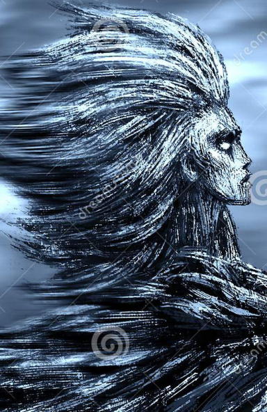
So CnC as promised.. there's not really much to talk about though :3
The positioning is nice for a render of this type so kudos on that. The lighting does seem a bit dull (though that seems intended with the nature of the tag). The depth is a bit off at certain parts where the sharpness/topaz filter(s) are applied. It feels a bit too strong and off at the render while the rest of the tag has a smooth, soft flow to it (you can fix this by applying the image, adding a 2.0 Gaussian blur on it and setting it to lighten while erasing everything except the render.
The text feels a bit off as well.. well not the entire thing, just the "Q" which is almost unnoticeable when placed near a black element.
Other than that, there's nothing else wrong with the tag.. KIU
")