[Photoshop] Itachi sig
- Thread starter Kakashi69
- Start date
More options
Who Replied?

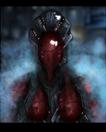

hm okay i'll keep in mind next timeTo much colors its like a palete use less colors and it would be better


maybe u got an example of how it should look?yeah less colors....and yeah the depth still isn't much......but better
and try a border.....

Awards

no blending, no flow, no depth, no lighting, text sucks, effects are completely messed up, too much colors. sorry but that's the ugly truth =\
although I can't help you in this, but check tutorials, don't follow them if you don't want,you can at least see some tips you may gain from them.
although I can't help you in this, but check tutorials, don't follow them if you don't want,you can at least see some tips you may gain from them.
Awards
well mainly what i wanted to say....but i wanted to say this in a less......... ofensive ......wayno blending, no flow, no depth, no lighting, text sucks, effects are completely messed up, too much colors. sorry but that's the ugly truth =\
although I can't help you in this, but check tutorials, don't follow them if you don't want,you can at least see some tips you may gain from them.
yeah some tuts could help