Awards
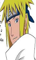
I made these 2 sigs after reading up on some new styles both are practice runs and would love any CnC on them anyway hope you like them.
You must be registered for see images
You must be registered for see images


Wow good eye, lol I only stretched it the smallest of margins as well I wasn't going to post the Cloud one since I do agree with you. But since it is a new style for me I thought I would get some views from the top dogs but cheers man.Ironman sig looks sweet!
Cloud, meh.. not really feeling the render, a bit blurry and LQ, seems like its stretched out.
Good job! =DD
Thanks, yeah will do it different next time.Ironman is quite good. I like the lighting.
Cloud is a bit dull... too much of the same colour.
Thank you.That is the most beautiful rendering of ironman and cloud i have ever seen Good work

Thanks bro might have a go at it later I wasn't originaly going to have the moon in it either.The scheme on the cloud 1 is my favorite of all yours so far, get a better quality render and redo that pic without the moon and it will be my fav =]
cant you get rid of it ?Thanks bro might have a go at it later I wasn't originaly going to have the moon in it either.
Yeah easy as, I will have to go back a few steps to do it but its easy just move they layer sideways a bit.cant you get rid of it ?
Loads better imo =] a like your best work yet imoYeah easy as, I will have to go back a few steps to do it but its easy just move they layer sideways a bit.
Here is the new version man, I removed the moon but I used the same render, but I think I improved the quality of the render to a degree and changed a couple of other things I just couldn't be bothered looking for a better quality render of him lol.
You must be registered for see images
Thanks heaps man.Loads better imo =] a like your best work yet imo