Awards
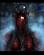
This sig was made for a SOTW.
You must be registered for see images

why 300 pagesWOW that is freaking awesome, make a tut with 300 pages xD


tydefinatly sum improvement, but it is way to chaotic =/
colors are a mess, but thats fine. focus more on the lighting and stuff, and especially flow
i totally lol`d at ur commentMy hero :T_T:
The awesomeness fills the room O_O


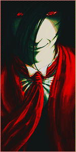
 Nice smudge effect and text is good too.