You are using an out of date browser. It may not display this or other websites correctly.
You should upgrade or use an alternative browser.
You should upgrade or use an alternative browser.
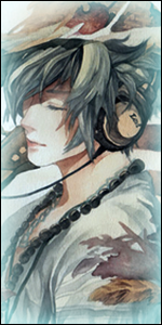
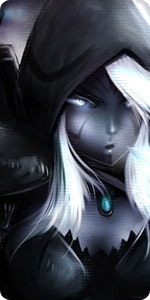
[Photoshop] Introduction|NB Theme:"Bijuu Base"
- Thread starter Drizzy
- Start date
More options
Who Replied?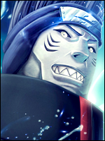


- Joined
- Apr 15, 2011
- Messages
- 13,954
- Reaction score
- 1,610
nice...awesome
Much appreciated. ^^

- Joined
- Apr 15, 2011
- Messages
- 13,954
- Reaction score
- 1,610
That's amazing !!!
You are so talented O_O
Thanks. ^^
- Joined
- Aug 3, 2011
- Messages
- 12,618
- Reaction score
- 872
Epic
- Joined
- Jul 4, 2011
- Messages
- 6,143
- Reaction score
- 2,009
Hmm, I looked at it a few times already and every time I begin to dislike it a bit more.
I know you're not done but you should have made sure that everything looks aligned etc.
But I am looking forward to your finished version, I think I'll do something like this as well (Not continuing the one I did already, gonna be a new one.)
So as of now, I voted "No".
Finished result better be awesome.
- Joined
- Apr 15, 2011
- Messages
- 13,954
- Reaction score
- 1,610
Hmm, I looked at it a few times already and every time I begin to dislike it a bit more.
I know you're not done but you should have made sure that everything looks aligned etc.
But I am looking forward to your finished version, I think I'll do something like this as well (Not continuing the one I did already, gonna be a new one.)
So as of now, I voted "No".
Finished result better be awesome.
Why so rough?
Looking forward to yours. o-o
Epic
That's amazing !!!
You are so talented O_O
Thanks. ^^
Last edited:
- Joined
- Jul 4, 2011
- Messages
- 6,143
- Reaction score
- 2,009
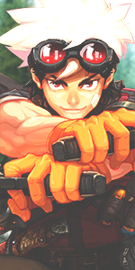
You must be registered for see images
Looking forward to yours. o-o
Not rough, just telling you the trough.
I know you can do way better, you were probably just too lazy.
S
Sublime
Guest
It's amzing but I like the one we have now as well....maybe if there would be optional themes.....
- Joined
- Jun 8, 2011
- Messages
- 10,750
- Reaction score
- 337
My Cookies and Cream
- The Big Banner of Naruto base thingy at the top...I don't think the colors go well...Kinda a bit too hard to read it...Maybe a bit lighter will do
- I really like what you did to the search bar well thought out!
- The "FAQ" and "Search" 's colours were changed so they could stand out more...But yours makes em camoflauge...I'd recoment a brighter colour, since it's on a black backround it would be easy to find a colour to stick out
- Overall...Flippen amazing...I like the Banner of Naruto and the Beast
You must be registered for see images