- Joined
- Mar 27, 2014
- Messages
- 6,442
- Reaction score
- 607
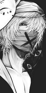
Nicely done, but the text isn't "too" legible
The canvas is ****ing huge, I don't even dare to write down the size of it. This is the reason the quality is ****ed up. This is how one part of the picture looks when it's resized (a lot):
You must be registered for see links
If you were referring to the choice of the text: well, dunno, I guess, everyone has different taste. If you are interested why I decided to have that text check my DA page and find description for this submission.
And tnx. xD
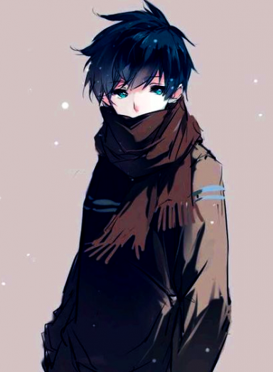
I think her text choice was perfect :3
Great work Azu~i love the way you presented it (the style and overall concept), i think it really fits with what you've written.
Keep it up.")
Thanks Nefer! <3
It's pretty good. <3
Tnx! xD
thats really good a gold star for youYou must be registered for see linksYou must be registered for see links
Tnx! xD
You must be registered for see images
Very nice xD
-_-
Awesome work and a big plus for Pablo Neruda.
Tnx! xD
:yayy: omg looks great Azuu!!!
Tnx! xD
Awesome work
Tnx! xD