Celestial Sanctuary
Member
You must be registered for see images
You must be registered for see images
woo


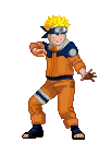
The first one is niceYou must be registered for see images
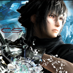
You must be registered for see images
woo
 but the left side and right side are completely different, 2 non-related sides, IMO it kinda killed it =\ text is nice, I want that font you used on the big letters the right side is horrible >.<
ty. i know what you mean on the 1st one. i like it less and less every time i look at it. went way overboard on the effects around him. lol
but the left side and right side are completely different, 2 non-related sides, IMO it kinda killed it =\ text is nice, I want that font you used on the big letters the right side is horrible >.<
ty. i know what you mean on the 1st one. i like it less and less every time i look at it. went way overboard on the effects around him. lolYou?re welcome ^_^
im just starting out this style on the 2nd. I haven't really seen anyone doing it and a lot of people really seem to like it. I'll have more of the same style soon.
Let me know Khaledio and Bianca if you can't find the font. I'll track it down ro PM it to you.

I think you already lost themYou?re welcome ^_^
i would like to request some of your tutorials if its not too much to ask, i dont have much time to exercise with ps now but i think i need help, im loosing all my skillz slowly xD