[Photoshop] heimerdinger [tag]
- Thread starter Kyoto Samurai
- Start date
More options
Who Replied?


Awards


Looks really good ^^
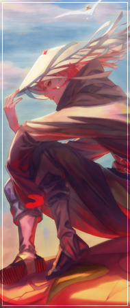
Nice depth and blending in the tag,And i also love how u used the C4d's with pentooling.
The only Cnc is to modify the texts with some other gradient maps lol
Nice depth and blending in the tag,And i also love how u used the C4d's with pentooling.
The only Cnc is to modify the texts with some other gradient maps lol

Awards


Nice job mate, the flow is pretty cool. I think the depth needs work though tbh, it has a good base depth but it needs some c4d work in the foreground and it needs to be kept sharp to really implement the depth.
The lighting and shading is the standout feature of the tag for me. I think you have a fantastic balance in there, that compliments the atmosphere nicely imo.
Lastly the text needs a lot more work done to it. I feel you have the placement perfect, but its really boring to look at and it doesn't add any impact to the tag. Its really hard to help when it comes to text because everyone has their own way of doing it. But if I was doing the text for this tag I would have made the word "Alien" a bit smaller, and I would have used either a standard ariel font or maybe a caligraphy type font. I would have made it the color pink with some gradient work on it. For the word "Heimerdinger" I would have used Impact for the font and made it all capital letters, then I would work on the spacing and height of the letters. I possibly would have kept the color black and used a 1px gradient stroke using pick and green. I also would have duplicated the layer and made it straight black, and adjusted its position by 1-2px to give it a shadow 3d look. For the word "Invader" I would have used the verdana font, and also had it all capitals. I would have made the size around 10px and again worked on the spacing and height. For color I may have gone with green and added a gradient map to it with a 1px black stroke. I would have moved this word to the top of the other text layers and placed the text itself just above the bottom of the main text to help give the text some depth. Lastly I would add some tiny text brushing for extra effects.
I hope this helps")
The lighting and shading is the standout feature of the tag for me. I think you have a fantastic balance in there, that compliments the atmosphere nicely imo.
Lastly the text needs a lot more work done to it. I feel you have the placement perfect, but its really boring to look at and it doesn't add any impact to the tag. Its really hard to help when it comes to text because everyone has their own way of doing it. But if I was doing the text for this tag I would have made the word "Alien" a bit smaller, and I would have used either a standard ariel font or maybe a caligraphy type font. I would have made it the color pink with some gradient work on it. For the word "Heimerdinger" I would have used Impact for the font and made it all capital letters, then I would work on the spacing and height of the letters. I possibly would have kept the color black and used a 1px gradient stroke using pick and green. I also would have duplicated the layer and made it straight black, and adjusted its position by 1-2px to give it a shadow 3d look. For the word "Invader" I would have used the verdana font, and also had it all capitals. I would have made the size around 10px and again worked on the spacing and height. For color I may have gone with green and added a gradient map to it with a 1px black stroke. I would have moved this word to the top of the other text layers and placed the text itself just above the bottom of the main text to help give the text some depth. Lastly I would add some tiny text brushing for extra effects.
I hope this helps

Awards
thanksNice .
thanks manLooks really good ^^
Nice depth and blending in the tag,And i also love how u used the C4d's with pentooling.
The only Cnc is to modify the texts with some other gradient maps lol
thanks for the feedback man. i always have trouble with text and how to make it stand out, I'll use this post as a guideNice job mate, the flow is pretty cool. I think the depth needs work though tbh, it has a good base depth but it needs some c4d work in the foreground and it needs to be kept sharp to really implement the depth.
The lighting and shading is the standout feature of the tag for me. I think you have a fantastic balance in there, that compliments the atmosphere nicely imo.
Lastly the text needs a lot more work done to it. I feel you have the placement perfect, but its really boring to look at and it doesn't add any impact to the tag. Its really hard to help when it comes to text because everyone has their own way of doing it. But if I was doing the text for this tag I would have made the word "Alien" a bit smaller, and I would have used either a standard ariel font or maybe a caligraphy type font. I would have made it the color pink with some gradient work on it. For the word "Heimerdinger" I would have used Impact for the font and made it all capital letters, then I would work on the spacing and height of the letters. I possibly would have kept the color black and used a 1px gradient stroke using pick and green. I also would have duplicated the layer and made it straight black, and adjusted its position by 1-2px to give it a shadow 3d look. For the word "Invader" I would have used the verdana font, and also had it all capitals. I would have made the size around 10px and again worked on the spacing and height. For color I may have gone with green and added a gradient map to it with a 1px black stroke. I would have moved this word to the top of the other text layers and placed the text itself just above the bottom of the main text to help give the text some depth. Lastly I would add some tiny text brushing for extra effects.
I hope this helps
