Awards
Here, like i promised ")
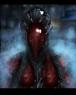
Trying to do some new stuff, so yh, first try in doing some new stuff
Trying to do some new stuff, so yh, first try in doing some new stuff
You must be registered for see images

sig cant be 2 small or 2 bigI like it a lot but it seems the space isnt apropriate for the theme cause there are tons of colors that dont fit and its a bit huge for a sig xD
thank you, i like when peaople give C&C.lookw nice to me, but I dont like the text
but can still be improved, flow is not perfect and focal seems to be on the light on the right side


Vector brushes..umm..splatter brushes,space stocks.i like it a lot and what brush did you use on it
LolI love it, alot mate.
The things that distract my eyes from the focals are the text, and the messed-up brushes at the bottom of his feet.
The text is a killer, remove it, or re-do it(I'm not saying you have to do it, but just saying you could : D)
I love the colors, they're bright and very pleasing to the eye.
The render isn't blended in, I know you can do better mate.
Ehmz.. What's left..
The background, maybe you could've blur it a bit, so you get a better focal?
Meh, good piece. I f'ng love it : D
Don't worry mang ;dLol
Sorry for da mistakes i did ..
Oh, coolDon't worry mang ;d
This goes in the Hall of Fame ;D