Futurstic Tag

Psy 2

Member
100 posts 17 reactions
Joined
Oct 17, 2014
Messages
100
Reaction score
17
Status
Offline
Activity Streak
You must be registered for see images


This other one is without text

You must be registered for see images

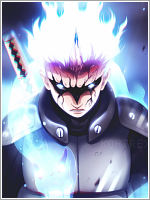
The render:

You must be registered for see images
CnC will be appreciated so I get better :)​
Lol, my bad for spelling the title wrong.
 
Last edited:

Migster257

Anbu Operative 🎭
Veteran
3,546 posts 234 reactions
Joined
Jun 26, 2014
Messages
3,546
Reaction score
234
Status
Offline
Activity Streak
Teach me your background making skills master.

Also, it's way better without the text. The text kinda ruins it to be honest.
 

Psy 2

Member
100 posts 17 reactions
Joined
Oct 17, 2014
Messages
100
Reaction score
17
Status
Offline
Activity Streak
Teach me your background making skills master.

Also, it's way better without the text. The text kinda ruins it to be honest.
I just downloaded a futuristic brushes added to the futuristic background then get a futuristic tag .
(simple way)
 

suki

Anbu Operative 🎭
Veteran
4,357 posts 808 reactions
Joined
Feb 9, 2013
Messages
4,357
Reaction score
808
Status
Offline
Activity Streak
I like the changes made on the render, that turned out well. What I don't really like is the background, I believe more depth should have been involved on the left (kinda looks empty). Also, the text in the second one.. Not that impressive. Keep working on texts. Not a bad tag overall... again you did a good job on the render just more work on the BG so it doesn't look like a simple stock. You are better than most people here skill wise so please keep sharing your stuff.

:p
 

Psy 2

Member
100 posts 17 reactions
Joined
Oct 17, 2014
Messages
100
Reaction score
17
Status
Offline
Activity Streak
I like the changes made on the render, that turned out well. What I don't really like is the background, I believe more depth should have been involved on the left (kinda looks empty). Also, the text in the second one.. Not that impressive. Keep working on texts. Not a bad tag overall... again you did a good job on the render just more work on the BG so it doesn't look like a simple stock. You are better than most people here skill wise so please keep sharing your stuff.

:p

I don't know why but I am not good at getting "depth" a lot times :sweat:
Thanks,I'll keep posting my progress with sigs and everything​
 

Migster257

Anbu Operative 🎭
Veteran
3,546 posts 234 reactions
Joined
Jun 26, 2014
Messages
3,546
Reaction score
234
Status
Offline
Activity Streak
I don't know why but I am not good at getting "depth" a lot times :sweat:
Thanks,I'll keep posting my progress with sigs and everything​

You make better backgrounds than me, but I'm better when it comes to depth lol.

Maybe we should team up to make the ultimate signature.

Just a little bit of darkening on the edges, blurring, and possibly dodging the render would work well.
 

Psy 2

Member
100 posts 17 reactions
Joined
Oct 17, 2014
Messages
100
Reaction score
17
Status
Offline
Activity Streak
You make better backgrounds than me, but I'm better when it comes to depth lol.

Maybe we should team up to make the ultimate signature.

Just a little bit of darkening on the edges, blurring, and possibly dodging the render would work well.

I would team up but these past days I have been extremely busy that's why I have not been on daily anymore.​
 

Migster257

Anbu Operative 🎭
Veteran
3,546 posts 234 reactions
Joined
Jun 26, 2014
Messages
3,546
Reaction score
234
Status
Offline
Activity Streak
I would team up but these past days I have been extremely busy that's why I have not been on daily anymore.​

I was kidding about that lol

I don't think it's really possible to "team-up" and make a signature.
I was thinking more along the lines of fusing like Gogeta type of thing.

I know what you mean. I've been extremely busy as well thwas past few days, and will be even busier in the upcoming weeks.
 

Hei

Supreme
23,898 posts 1,602 reactions
Joined
Aug 22, 2011
Messages
23,898
Reaction score
1,602
Status
Offline
Activity Streak
It is oversaturated.You lost some natural colors,that render has ...they could be in good use.
Nefi said right about emptiness in your tag.Either make signatures smaller or think over new concept that would fill left space.
if you're not good at depth as you admitted yourself,i'll recommend to watch some tutorials (there are plenty all over the net).
Keep practicing `
 

KameSennin

Anbu Operative 🎭
Veteran
4,729 posts 62 reactions
Joined
Mar 9, 2014
Messages
4,729
Reaction score
62
Status
Offline
Activity Streak
nice work​
 

Psy 2

Member
100 posts 17 reactions
Joined
Oct 17, 2014
Messages
100
Reaction score
17
Status
Offline
Activity Streak
It is oversaturated.You lost some natural colors,that render has ...they could be in good use.
Nefi said right about emptiness in your tag.Either make signatures smaller or think over new concept that would fill left space.
if you're not good at depth as you admitted yourself,i'll recommend to watch some tutorials (there are plenty all over the net).
Keep practicing `

Thanks for the CnC but I am curious of what you mean when you say I could have use the render colors in to good use.
 

Hei

Supreme
23,898 posts 1,602 reactions
Joined
Aug 22, 2011
Messages
23,898
Reaction score
1,602
Status
Offline
Activity Streak
Thanks for the CnC but I am curious of what you mean when you say I could have use the render colors in to good use.

You dimmed 2 colors light blue (spiral light) and his hair color,basically you could make those you focal point but you made both render and background monotonous and pale.The light is too bright,which i find very disturbing for eyes.
 

Psy 2

Member
100 posts 17 reactions
Joined
Oct 17, 2014
Messages
100
Reaction score
17
Status
Offline
Activity Streak
You dimmed 2 colors light blue (spiral light) and his hair color,basically you could make those you focal point but you made both render and background monotonous and pale.The light is too bright,which i find very disturbing for eyes.

I get what you are saying but I made that choice to make the render less dim so that electric part of the render could stand out.
I personally think I shouldn't add another color if the signature is already "over-saturated."
That was the reason why my main colors purple and gray(monotonous) part.
 
Top