You are using an out of date browser. It may not display this or other websites correctly.
You should upgrade or use an alternative browser.
You should upgrade or use an alternative browser.
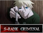
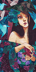
[Photoshop] Frozen Shen
- Thread starter -Carnage-
- Start date
More options
Who Replied?

- Joined
- Jul 4, 2012
- Messages
- 8,222
- Reaction score
- 661
yeah, got it backNot bad bro, assuming you made a sig you got photoshop back again right ?
And its Blue xD
Edit: 7,500th post

lol i still hate blue o_o
cungrajulashuns!
- Joined
- Jan 18, 2013
- Messages
- 12,598
- Reaction score
- 1,361
Nice sig. Though, Kennen > Shen XD
Zed > Kennen

- Joined
- Apr 14, 2009
- Messages
- 6,666
- Reaction score
- 210
Shen... My main bro. Respect Looks sick
Looks sick
- Joined
- Jul 4, 2012
- Messages
- 8,222
- Reaction score
- 661
ThanksNice sig. Though, Kennen > Shen XD
Okie dokieZed > Kennen
Got it >_O, I'll do datwell,it needs some more depth but it is pretty good!
Thanks!
ThanksShen... My main bro. Respect
Thanks!MAKE ME LE SIGGY!!!!!!!
nice sig btw shen is a sht player though <_< talon solo's anyday
o_o

- Joined
- Dec 29, 2011
- Messages
- 4,521
- Reaction score
- 295
Looks sick bro ^.^

- Joined
- Jun 3, 2011
- Messages
- 11,189
- Reaction score
- 429
pretty good


TobiramaSageMode
Member
- Joined
- Mar 28, 2013
- Messages
- 26
- Reaction score
- 0
waaa nice! I main shen too

- Joined
- Jul 4, 2012
- Messages
- 8,222
- Reaction score
- 661
Thanks guys
maybe it is, it looked better in the dark background in photoshop
and i like how it made the stroke on the "frozen" part stand out more
....and it would help if you were a little more specific with the "details" it needs, or where it's missing a sufficient amount. >____> 'cause to me it's got plenty of detail, adding any more would make it look messy.
Mina! you're back!Too much contrast, no? Not bad though.
maybe it is, it looked better in the dark background in photoshop
That was intentional actually, without the topaz the text was barely visibleLook like you put too much topaz where the text is get a soft brush erase that part look garbage ._. Pretty good but need a little more details to me
and i like how it made the stroke on the "frozen" part stand out more
....and it would help if you were a little more specific with the "details" it needs, or where it's missing a sufficient amount. >____> 'cause to me it's got plenty of detail, adding any more would make it look messy.
- Joined
- Jan 29, 2012
- Messages
- 4,453
- Reaction score
- 257
I was talking about the mini text in details I mean other color then blueThanks guys
Mina! you're back!
maybe it is, it looked better in the dark background in photoshop
That was intentional actually, without the topaz the text was barely visible
and i like how it made the stroke on the "frozen" part stand out more
....and it would help if you were a little more specific with the "details" it needs, or where it's missing a sufficient amount. >____> 'cause to me it's got plenty of detail, adding any more would make it look messy.
like maybe some white highlight dodge burn so me spot