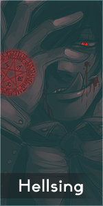
The smudging itself is nice, I like it a lot and you definitely have a lot of potential to make some very nice smudges in the future.
Only problem is you're missing the fundamentals of a sig such as lighting, flow, depth, etc. (the flow is there, it's just messy) your placement is limiting you too much, I don't like it, a bit more to the right or left would've been optimal. The sig would've been nicer if you smudged the bottom left part of the render as well.
This was awesome for a first attempt because you're great at the actual smudging itself.
MAKE MOREEEEE. Pro tip: Smudges look 10x better over-sharpened.