So I made an Edward Elric Signature today >_<.. It's my first signature and I am new to this GFX World so please don't be like "Booo!". I made this signature without looking at any website or peek at any tutorial available out there.
Alright, for the first try, it is not bad at all. What I would suggest now is not something specific like use this, don't use this...But rather keep practicing and toying around with new features and effects. If you use photoshop,use more layer masking, the new brush designs, layer effects, clipping masks, the fill and adjustment layers, and key here is the filter menu and the filter gallery to make your work pop out.
Alright, for the first try, it is not bad at all. What I would suggest now is not something specific like use this, don't use this...But rather keep practicing and toying around with new features and effects. If you use photoshop,use more layer masking, the new brush designs, layer effects, clipping masks, the fill and adjustment layers, and key here is the filter menu and the filter gallery to make your work pop out.
Ok, good start! *_* Lets start with CnC now, shall we!
I like the choice of the render. It's not too complicated and there are no strange colors on him so that you need to worry a lot about the light behind because of that.
I like how you recognized that render would be placed better if you use rule of thirds then place it in the middle. Placement is very important for the beginners.
Now the problematic things that we have that you should correct when you continue to be better at this:
*As I mentioned placement was good but to be better maybe you should put the focus on the center of the face of the render
You must be registered for see images
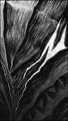
So here you have lines that depicts rule of the thirds. If you put the nose of the render closed to the place where lines cross I think it would look better and not just for the focus of the render but for overall look of the tag.
*Ok, BG is too plain. You don't have any depth to it, any light. In order to create good tag you need to create something that looks real. When you take a photo or when you are looking at some scene in real life what do you see? All the elements, shadows, lights everything needs to be included.
*And to continue the same story you need to work more on details and for that try using different fractals, C4Ds and stuff like that. Try experimenting different things.
Ok, good start! *_* Lets start with CnC now, shall we!
I like the choice of the render. It's not too complicated and there are no strange colors on him so that you need to worry a lot about the light behind because of that.
I like how you recognized that render would be placed better if you use rule of thirds then place it in the middle. Placement is very important for the beginners.
Now the problematic things that we have that you should correct when you continue to be better at this:
*As I mentioned placement was good but to be better maybe you should put the focus on the center of the face of the render
You must be registered for see images
So here you have lines that depicts rule of the thirds. If you put the nose of the render closed to the place where lines cross I think it would look better and not just for the focus of the render but for overall look of the tag.
*Ok, BG is too plain. You don't have any depth to it, any light. In order to create good tag you need to create something that looks real. When you take a photo or when you are looking at some scene in real life what do you see? All the elements, shadows, lights everything needs to be included.
*And to continue the same story you need to work more on details and for that try using different fractals, C4Ds and stuff like that. Try experimenting different things.