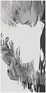


Now currently this is the banner and the template we use for the official chapter threads:
"400 Years"
Fairy Tail Manga Chapter 465 Discussion and 466 Predictions
Discuss Fairy Tail Manga 465 here and predict the next chapter, Fairy Tail Manga 466
Please remember to rate this week's chapter!
1 is worst, 5 is best.
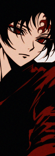
However the banner has always bugged me. It's simply too vertical, which stretches out the entire post. I tried to resize it, but then the banner width would become to small. Also I find it redundant to have it say "General Discussion" while that's already mentioned in the title and the thread. The only reason I kept it for this long was because a member once made it.
Now I want to change the banner back to original FT logo, which is much more suitable and as a result the template has to change too. So this is what I made of it:
"400 Years"
Fairy Tail Manga Chapter 465 Discussion and 466 Predictions
Discuss Fairy Tail Manga 465 here and predict the next chapter, Fairy Tail Manga 466
Please remember to rate this week's chapter!
1 is worst, 5 is best.
I made this thread to see what the other people think of this matter. If most prefer prefer the current one, I will let it go.
You must be registered for see images
"400 Years"
Fairy Tail Manga Chapter 465 Discussion and 466 Predictions
Discuss Fairy Tail Manga 465 here and predict the next chapter, Fairy Tail Manga 466
You must be registered for see links
Please remember to rate this week's chapter!
1 is worst, 5 is best.
However the banner has always bugged me. It's simply too vertical, which stretches out the entire post. I tried to resize it, but then the banner width would become to small. Also I find it redundant to have it say "General Discussion" while that's already mentioned in the title and the thread. The only reason I kept it for this long was because a member once made it.
Now I want to change the banner back to original FT logo, which is much more suitable and as a result the template has to change too. So this is what I made of it:
You must be registered for see images
"400 Years"
Fairy Tail Manga Chapter 465 Discussion and 466 Predictions
Discuss Fairy Tail Manga 465 here and predict the next chapter, Fairy Tail Manga 466
You must be registered for see links
Please remember to rate this week's chapter!
1 is worst, 5 is best.
I made this thread to see what the other people think of this matter. If most prefer prefer the current one, I will let it go.