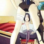
These are all kinda terrible =/
I mean, only two of them are really ecchi, the first and the third. Cleavage isn't really ecchi, thats just shonen standard, and the Mirajane image is conservative by Fairy Tails standards, Mashima has waaay more provocative art than that.
On the design side, the third is the only one that even matches the background, even then, along with the rest, it's just a render plastered on a box, there's no evidence of theme, blending or graphical manipulation, i don't know how long you've been making sigs or graphics, i suppose if you're a beginner, then it's slightly above average, but i'd suggest taking some tutorials and try learning to make sigs with more depth and meaning. For instance, the temari render is a full render, no cut offs, why do you need that box behind her, you don't need it, why not have sand swirling around her, and forming a tag, somthing interesting, not an orange box.
Constructive criticism, take it or leave it, best of luck in your future endeavors.
")