You are using an out of date browser. It may not display this or other websites correctly.
You should upgrade or use an alternative browser.
You should upgrade or use an alternative browser.
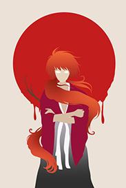
[Photoshop] Dracule Mihawk Signature
- Thread starter LitzSabr
- Start date
More options
Who Replied?
- Joined
- Dec 11, 2012
- Messages
- 1,120
- Reaction score
- 116
its great.. except that its one piece

- Joined
- Jan 8, 2013
- Messages
- 8,651
- Reaction score
- 90
Well done.


- Joined
- Jan 2, 2013
- Messages
- 8,559
- Reaction score
- 1,684
mihawk is cool xd

- Joined
- Jun 1, 2013
- Messages
- 1,419
- Reaction score
- 264
If you attempted an air sig, its horrible U_U
If this is a first try its good, there is an air sig tut on the base. Look it up.
Edit: The text was pointless, not much detail, the BG is kinda small, empty and stretched, make it a bit compressed and full of effects and colors.
If this is a first try its good, there is an air sig tut on the base. Look it up.
Edit: The text was pointless, not much detail, the BG is kinda small, empty and stretched, make it a bit compressed and full of effects and colors.
Last edited:


- Joined
- Mar 13, 2013
- Messages
- 3,045
- Reaction score
- 226
If you attempted an air sig, its horrible U_U
If this is a first try its good, there is an air sig tut on the base. Look it up.
Point out the major flaws in there, I won't know what went wrong without that you know
You must be registered for see images
I'll be sure to check the tut. U_U
Last edited:

- Joined
- Mar 11, 2013
- Messages
- 14,587
- Reaction score
- 1,222
How about instead of saying it sucks, why not point out the stuff that you think are wrong. In my opinion it seems nice, thought the txt is quite pointless seeing as how it's barely readable, try another color. Overall its good.If you attempted an air sig, its horrible U_U
If this is a first try its good, there is an air sig tut on the base. Look it up.

- Joined
- Sep 26, 2012
- Messages
- 12,510
- Reaction score
- 418
Fantastic job, KIU
- Joined
- Mar 13, 2013
- Messages
- 3,045
- Reaction score
- 226
Edit: The text was pointless, not much detail, the BG is kinda small, empty and stretched, make it a bit compressed and full of effects and colors.
I do somewhat agree on the Text part. It looks a little good without it I've checke in its own way. I for myself liked the text for Mihawk, Thanks for the rest,, I'll see how it'll go by doing the tweaks on BG. :yeah:
How about instead of saying it sucks, why not point out the stuff that you think are wrong. In my opinion it seems nice, thought the txt is quite pointless seeing as how it's barely readable, try another color. Overall its good.
Thanks and wwll that's what I wanted to make it look, higher visibility wasn't making the rest of the image good, alittle more will suffice. And thanks ^ ^.
-Also thanks to everyone who liked it. :yeah:
Last edited:

- Joined
- May 18, 2012
- Messages
- 5,495
- Reaction score
- 360
It looks... nice for its own style.
- Joined
- Mar 11, 2013
- Messages
- 14,587
- Reaction score
- 1,222
Those situations happen very often, another font that matches would have done the trick or probably a small text on top of Mihawks sword would have worked too :bThanks and wwll that's what I wanted to make it look, higher visibility wasn't making the rest of the image good, alittle more will suffice. And thanks ^ ^.
-Also thanks to everyone who liked it. :yeah: