[Photoshop] Devil May Cry

Ali G MPGH

Active member
Regular
Joined
Dec 27, 2009
Messages
991
Kin
0💸
Kumi
0💴
Trait Points
0⚔️
Awards
Okay.. a DMC sig.

V1
You must be registered for see images


V2
You must be registered for see images


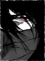
V3 ( I love it ;D, i think its the best)
You must be registered for see images


Give much CnC guys :)

Btw..sb wanted a DMC sig from me..i dun remember who it was O__o, so dude, if u check this thread, just comment here or PM me, ill change ``Ali G`` to your name :D
 

Caliburn

Supreme
Joined
Apr 6, 2009
Messages
20,771
Kin
2,805💸
Kumi
525💴
Trait Points
0⚔️
I hate it when GFXers ask to choose between sigs who only differ a bit >.<

The first one gives me more the feeling of being in a warm, burning environment that is on fire or something.

Second is like normal and the third is so white it's like that moment just before a bomb always explodesxd

I think the third is to white, so I would say V1 or V2

All three are great though.
 

Ali G MPGH

Active member
Regular
Joined
Dec 27, 2009
Messages
991
Kin
0💸
Kumi
0💴
Trait Points
0⚔️
Awards
I hate it when GFXers ask to choose between sigs who only differ a bit >.<

The first one gives me more the feeling of being in a warm, burning environment that is on fire or something.

Second is like normal and the third is so white it's like that moment just before a bomb always explodesxd

I think the third is to white, so I would say V1 or V2

All three are great though.
Lol..they have diff :D
Third= DMC is a bomb..so he explodes :D

ty dude :D
 

Musashibo

Active member
Legendary
Joined
Dec 26, 2008
Messages
11,706
Kin
0💸
Kumi
0💴
Trait Points
0⚔️
Awards
I like only the first one. I'm not sure, but it's just the feeling on the sig. I love how you worked the text, but the pink dot things on the right are annoying me. >.> Either way it's a sick sig and a cool theme. I like what you did with the gun, but with the other gun it seems weird and tacky. Good job over all.
 

NarutoGoku

Active member
Veteran
Joined
Jun 7, 2008
Messages
4,270
Kin
0💸
Kumi
0💴
Trait Points
0⚔️
Awards
not seeing any flow... the stuff all together is a bit of a mess, and the colors are kind of messy in the 1st. the last blends the best, however it still isnt great.

i like what you were going for, however, you need to pay more attention to your focal.. all the background stuff is too apparent, and there is no real focal...

i would recomend thinking more about the placement of things and working with the colors more. overall, it looks better, but it is cluttered.... also, the whole thing looks very flat becuz you didnt focus on anything in particular
 
Top