You are using an out of date browser. It may not display this or other websites correctly.
You should upgrade or use an alternative browser.
You should upgrade or use an alternative browser.
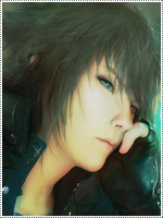
[Gimp] Cool Sasuke Pic...
- Thread starter Fex
- Start date
More options
Who Replied?- Joined
- May 20, 2013
- Messages
- 981
- Reaction score
- 121
You can do it alot better
- Joined
- Mar 14, 2014
- Messages
- 1,679
- Reaction score
- 305
Yeah..I kind of spent a small time on it
You can do it alot better


- Joined
- Dec 26, 2012
- Messages
- 3,327
- Reaction score
- 415
The time he activated his Sharingan? Yeah, loved that scene. ")

- Joined
- Apr 30, 2010
- Messages
- 973
- Reaction score
- 281
I hate to be harsh but its the only way your going to improve :S its realllly not the best his hair is missing the bg is way too obviouse that you just copied the render all over and blured it, the text is too big and stands out too much it needs to be close to the focal smaller and less obvious. Another point try not to put the focal in the center of a canvas it makes it look bad most of the time =[ the colours are also kinda dull
!
his hair is missing the bg is way too obviouse that you just copied the render all over and blured it, the text is too big and stands out too much it needs to be close to the focal smaller and less obvious. Another point try not to put the focal in the center of a canvas it makes it look bad most of the time =[ the colours are also kinda dull
You must be registered for see links
thats a pretty cool tutorial for you to try and work from and some of the other tutorials on that site. Again dont wanna be too harsh but keep up the good work !