
Awards

Don't ask me about the thread's title. >__>
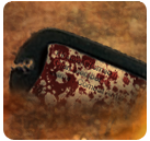
Anyway, another two SIGs I made recently. Give me a harsh C&C.
In case you like my work, go and request @ my
Anyway, another two SIGs I made recently. Give me a harsh C&C.
You must be registered for see images
You must be registered for see images
In case you like my work, go and request @ my
You must be registered for see links


 but I'll give you the key areas you need to work on: Blending(could never be over-emphasized), and the backgrounds( they seem incomplete, or not very well made), you could try using a stock for your bg, till you're able to create the perfect background for your sig