Colorless

Melodious

Sannin of the Scrolls 📜
Elite
Joined
Feb 11, 2012
Messages
6,612
Reaction score
900
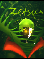
I wanted to try some new things.. I decided to give 'em no color. xD Though, they didn't turn out as well as I expected them to. D:

You must be registered for see images


No text:
You must be registered for see images

---

You must be registered for see images


Resources:
You must be registered for see images


You must be registered for see images

Cnc is much appreciated. ^^

I think the 2nd render is amazing and I'll probably use it again sometime.
 

Kages

Kage in the Making 👑
Legendary
Joined
Nov 23, 2012
Messages
16,549
Reaction score
877
Amazing job :T_T:
 

Melly

Jōnin Strategist 🧠
Veteran
Joined
Oct 13, 2012
Messages
2,128
Reaction score
282
That's really good! =DD
 

-S-

Legendary Shinobi 🐸
Immortal
Joined
Jan 16, 2011
Messages
41,396
Reaction score
2,409
Love both of them!

Perhaps on the second one you could make her hair blend into the background more :p
 

Ciao

Sannin of the Scrolls 📜
Elite
Joined
Jul 11, 2012
Messages
6,568
Reaction score
760
Well done, Hime.
:bouncy:
 

chad062388

Anbu Operative 🎭
Veteran
Joined
Jan 8, 2011
Messages
2,749
Reaction score
238
Beautiful work
You must be registered for see images
 

Melodious

Sannin of the Scrolls 📜
Elite
Joined
Feb 11, 2012
Messages
6,612
Reaction score
900
:x3:
awesome

Amazing job :T_T:

That's really good! =DD

Love both of them!

Perhaps on the second one you could make her hair blend into the background more :p

they look Really awesome

Well done, Hime.
:bouncy:

Beautiful work
You must be registered for see images

Nice work, your'e really good

Thanks! ^^

@-S-: Oh yeah! I see what you mean. xP
 

Shuuya

Anbu Operative 🎭
Veteran
Joined
Nov 28, 2010
Messages
2,772
Reaction score
570
First sig looks nice, love the flow and there's a decent bit of depth. Good job :)
 

-Avenger-

Sannin of the Scrolls 📜
Elite
Joined
Jul 23, 2010
Messages
8,494
Reaction score
724
The bg and that style doesn't suit the 1st render mainly because of the wings. "Red Bull Gives you wings" :bouncy:
The second tag looks nice. The depth looks decent, the smudge to go with flow. Though I feel the hairs should be little blurry and not sharp.
 

Cypher

Jōnin Strategist 🧠
Regular
Joined
Feb 13, 2013
Messages
1,092
Reaction score
160
that first one looks like a rip to me not because i dont trust you but im pretty sure ive seen it b4 but in color
 

Yveltal

Sannin of the Scrolls 📜
Elite
Joined
Apr 10, 2012
Messages
5,497
Reaction score
523
Beautiful as always :ls:
 

Melodious

Sannin of the Scrolls 📜
Elite
Joined
Feb 11, 2012
Messages
6,612
Reaction score
900
First sig looks nice, love the flow and there's a decent bit of depth. Good job :)

Thanks! ^^

The bg and that style doesn't suit the 1st render mainly because of the wings. "Red Bull Gives you wings" :bouncy:
The second tag looks nice. The depth looks decent, the smudge to go with flow. Though I feel the hairs should be little blurry and not sharp.

Thanks! ^^ Ah, yes, I agree. ;D

that first one looks like a rip to me not because i dont trust you but im pretty sure ive seen it b4 but in color

Okay.. Good luck finding something that doesn't exist. >.> I can prove that I made it, only I don't know how.

Beautiful as always :ls:

Thanks! ^^
 
Top