Awards
united work from my Mihawk..*cough* Fag <3
dedicated to Pesh, for beang in the midle of our ''discusion''
dedicated to Pesh, for beang in the midle of our ''discusion''
You must be registered for see images


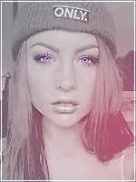
im making all my last works of real people i know, and people close to meShe is ugly but still nice Signature.
")

She ain't ugly at all, just looks too serious. ;Dim making all my last works of real people i know, and people close to me
Julia, Alexandra, Leenu and so on, Carmen isnt the hotest of them but ugly? heh come on
what you mean by hand? u just take a broken glass counture, then some scratcgy brush and mix them, blend and it's doneI'd kill to know how to make this glass O___O
.. tryed it a houndred times by hand. I <3 it and she's not ugly D:<

have to aggre with u she doesnt get a uglyim making all my last works of real people i know, and people close to me
Julia, Alexandra, Leenu and so on, Carmen isnt the hotest of them but ugly? heh come on
yap, made with layer blending mode ''color'' ontop of bgok i realy like it but have a question is the inside of the glass behind the chick black and white then on the glass it colored right
ok couldnt tell thought my eyes were ****ing up on meyap, made with layer blending mide ''color'' ontop of bg
Good for you! It may not have turned out as you intended, but at least you put in the effort of trying something new.By hand I mean I made a path with magic lasso that already looks like broken glass, colored it with a low opacity and brighted the edges on some parts. But it always look crap D:
Yours is amazing
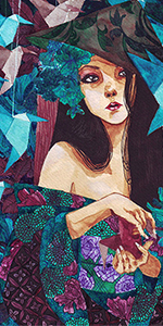
image was bright from bouth side from the start, source cuold be outside of the image, in cornerGreat concept, I like it.
The only problems are your lighting and those clouds. They look too dense to be fog/mist, and so it looks a bit odd to have clouds floating around in a tunnel.
I would smudge/blur them and create more of a mist as I think that's what you were going for.
The lighting is good until it gets to the girl. Her left side is well done, but I'm not sure what is making her right side so bright, it doesn't really make sense in the flow of the picture as your main light source could not even reach that side of her.
You could squeeze some extra depth out of the picture by sharpening the wall towards the front and doing a progressive blur towards the back, rather than having it all as one blur setting.
Over all good job though. And she is not ugly. =)
it's to late to fix it anyway, it will do as it is now 


Break a glass and take a picture.I'd kill to know how to make this glass O___O
.. tryed it a houndred times by hand. I <3 it and she's not ugly D:<