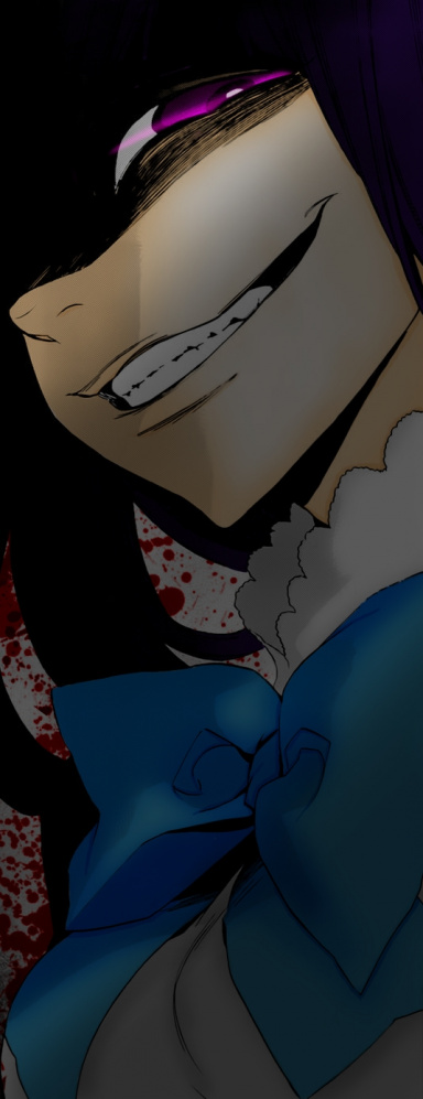
Great job, Noto! ;D
Only two things:
1) The placement of the text it "meh". It's just chillin' up there in the corner, and it's almost off the canvas. Try to put the text closer to the render. You could have place it just below the render and either to the left, right, or center. Or somewhere else entirely, just as log as it isn't pretty much off the border, and is closer to the main render. You could also download some
You must be registered for see links
and add feature text. That would compliment it more. You must also try different fonts, but this is a great start!

2) I don't believe there was a light source put in, unless I am mistaken. It was just the left corner and up darkened? Putting in a light source can be as simple as a large soft brush and plain white colour. Just hit it down a few times when the brush is going on the canvas, change the layer blending mode to Overlay and lower the opacity.
Anyway, KIU buddy!
ekoms2: