You are using an out of date browser. It may not display this or other websites correctly.
You should upgrade or use an alternative browser.
You should upgrade or use an alternative browser.
Claymore TAG
- Thread starter Chihaya
- Start date
More options
Who Replied?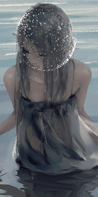


- Joined
- Mar 30, 2011
- Messages
- 6,190
- Reaction score
- 1,102
those light orbs takes away the viewers attention from the focal

- Joined
- Aug 22, 2011
- Messages
- 23,898
- Reaction score
- 1,601
I think you're slowly improving,seeing you making real tags like this is a good sign already.Watch some basic tutorials about depths and blending,a bit more practice and eventually you will improve far more.For you now it's the best way get to know more about different gfx related stuff than giving full CnC.
As for text,the best for beginners is keep as simplies as possible,otherwise it can affect the whole concept of your tag.Don't forget the rule of thirds,while placing it,since text is basically your second focal(after the main one).
Keep it up.If you need any help with tutorials or so,just vm/pm me.

- Joined
- Jun 3, 2011
- Messages
- 5,571
- Reaction score
- 444
i don't have any constructive comments :/ nice work
- Joined
- May 16, 2014
- Messages
- 20,732
- Reaction score
- 683
The only thing I don't like in your work is those text .