[Photoshop] Beginner Graphics Stack 2

NegativeSal

Member
Joined
Apr 9, 2012
Messages
93
Kin
0💸
Kumi
0💴
Trait Points
0⚔️
Hello everyone!
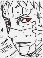
I'm posting my newest stack of my beginner's Graphics, but this time its Photoshop instead of GIMP. Two are manga coloring, its not good, but kind of missed up a little. And the other two are icons colorings (not manga coloring, cropped into icons, but just psd colorings).

Manga Coloring:

You must be registered for see images

You must be registered for see images

Icon:

You must be registered for see images

You must be registered for see images
 

Bluedevil

Active member
Regular
Joined
Aug 2, 2010
Messages
1,124
Kin
0💸
Kumi
0💴
Trait Points
0⚔️
not a bad start, I would not have the gradient on the top layer. It will make your character, the main subject, pop out and become the focus of the piece.
 

Ebi..

Active member
Elite
Joined
Jan 18, 2012
Messages
8,743
Kin
0💸
Kumi
0💴
Trait Points
0⚔️
Awards
putting that gradient on top...
You must be registered for see images


I dont really recommend you to use soft shading if you dont know how to use it, Dont go out of the lines and I have no idea what you mean by Icons :silly:
but you starting to get the hang of it, so keep it up and work hard
 
Last edited:

Mercy

Active member
Elite
Joined
Jul 4, 2011
Messages
6,143
Kin
0💸
Kumi
0💴
Trait Points
0⚔️
You did a great job on the colorings, for you being new to it and all. Especially the second one, it looks nice. As for the first one, never use an actual Manga Panel as lineart. It just doesn't look good and is illegal at that. (Not like you could get in trouble, it's just that it could get removed if you posted it on DeviantArt

As for the type of shading, try not to make the shades too soft so they still have a certain shape, other than that - Just continue on practicing.

putting that gradient on top...
I fail to see how the gradient is on top.
 

Ebi..

Active member
Elite
Joined
Jan 18, 2012
Messages
8,743
Kin
0💸
Kumi
0💴
Trait Points
0⚔️
Awards
You did a great job on the colorings, for you being new to it and all. Especially the second one, it looks nice. As for the first one, never use an actual Manga Panel as lineart. It just doesn't look good and is illegal at that. (Not like you could get in trouble, it's just that it could get removed if you posted it on DeviantArt

As for the type of shading, try not to make the shades too soft so they still have a certain shape, other than that - Just continue on practicing.


I fail to see how the gradient is on top.
Look at the light shaded parts, youll notice that the bottom is blue-ish and the top of her hair is green-ish. >_> didnt see the new part. Listen to mercy he knows better U_U
 

NegativeSal

Member
Joined
Apr 9, 2012
Messages
93
Kin
0💸
Kumi
0💴
Trait Points
0⚔️
not a bad start, I would not have the gradient on the top layer. It will make your character, the main subject, pop out and become the focus of the piece.
Lol, its not on top, its actually on the bottom. and i got this idea from someone else, she's good at coloring. I only added the lighting, that's why it looks darker at top than the bottom portion
putting that gradient on top...
You must be registered for see images


I dont really recommend you to use soft shading if you dont know how to use it, Dont go out of the lines and I have no idea what you mean by Icons :silly:
but you starting to get the hang of it, so keep it up and work hard
Icons are 100x100 images. And I called that section Icon because the graphics are 100x100 widthxheight. The gradient is on the bottom. It was suppose to color the background. And I never said I was good at anything .O_O

You did a great job on the colorings, for you being new to it and all. Especially the second one, it looks nice. As for the first one, never use an actual Manga Panel as lineart. It just doesn't look good and is illegal at that. (Not like you could get in trouble, it's just that it could get removed if you posted it on DeviantArt

As for the type of shading, try not to make the shades too soft so they still have a certain shape, other than that - Just continue on practicing.


I fail to see how the gradient is on top.
Lol. Actually i posted it on it. No one said anything; and been posting on there for a year now, its just that as long as you put the credits, its fine. That's what they said in one of their rules. And It doesn't really matter if its line art or manga scans, because Manga scans are easier to color; thats why beginner like to use it, because it already have every details; line art is more for professional colorers; as well as its harder. Well actually for that one; its only been a week or so, but i had other manga art coloring, on my DA for a year, none was reported or warned.

As I said, "Beginner" I'm still a beginner, and I don't really like using photoshop to color, but thanks for the advice though.

Lol thank you :)
 

Ebi..

Active member
Elite
Joined
Jan 18, 2012
Messages
8,743
Kin
0💸
Kumi
0💴
Trait Points
0⚔️
Awards
Lol, its not on top, its actually on the bottom. and i got this idea from someone else, she's good at coloring. I only added the lighting, that's why it looks darker at top than the bottom portion
Icons are 100x100 images. And I called that section Icon because the graphics are 100x100 widthxheight. The gradient is on the bottom. It was suppose to color the background. And I never said I was good at anything .O_O

Lol. Actually i posted it on it. No one said anything; and been posting on there for a year now, its just that as long as you put the credits, its fine. That's what they said in one of their rules. And It doesn't really matter if its line art or manga scans, because Manga scans are easier to color; thats why beginner like to use it, because it already have every details; line art is more for professional colorers; as well as its harder. Well actually for that one; its only been a week or so, but i had other manga art coloring, on my DA for a year, none was reported or warned.

As I said, "Beginner" I'm still a beginner, and I don't really like using photoshop to color, but thanks for the advice though.

Lol thank you :)
Seriously ._. your writing hurts, you should at least make it bigger or less brighter ._.

Hmm i see, looked on top to me. and if you want to graduate from "beginner" try using real lineart so that we can see the results of your yearly coloring.
 
Top