You are using an out of date browser. It may not display this or other websites correctly.
You should upgrade or use an alternative browser.
You should upgrade or use an alternative browser.
[Photoshop] Been a long while.... Again o.o
- Thread starter Method
- Start date
More options
Who Replied?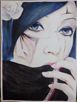
- Joined
- Jun 12, 2013
- Messages
- 1,485
- Reaction score
- 254
sexy awesome


- Joined
- May 6, 2013
- Messages
- 3,276
- Reaction score
- 382
Some more light on the down left corner would be good. And then, extend it to the bottom of the pic. You have to put the main thing in the pic in the center of view, it has to be very visible. Other than this, good work! ")

- Joined
- Jun 20, 2012
- Messages
- 2,336
- Reaction score
- 270
It's..........................okay but not good though :yeah:


- Joined
- May 29, 2013
- Messages
- 13,123
- Reaction score
- 692
sexy awesome
DAMN !!!!! when you put a girl writting this , you must be awesome !
aizen planned your awesomeness before you were born


- Joined
- Jun 12, 2013
- Messages
- 1,485
- Reaction score
- 254
DAMN !!!!! when you put a girl writting this , you must be awesome !
aizen planned your awesomeness before you were born
oh hell yeh XD


- Joined
- Feb 8, 2012
- Messages
- 8,150
- Reaction score
- 671
Thanks all
It was meant to be dark but not this dark xd. I dunno what I was looking at but it seemed much lighter while I was making it. I'm getting back into a groove so I didn't want to put too much into it. Still trying to fix up on my blending & so on.
Hmm. The first one is better. Is it meant to be dark? The left side looks a little blank IMO. Though the placement of the resources are pretty good. Nice job overall though ^^
It was meant to be dark but not this dark xd. I dunno what I was looking at but it seemed much lighter while I was making it. I'm getting back into a groove so I didn't want to put too much into it. Still trying to fix up on my blending & so on.