[Photoshop] Batman Tag
- Thread starter Jin
- Start date
More options
Who Replied?


I am not a big fan of it, here is some CnC:
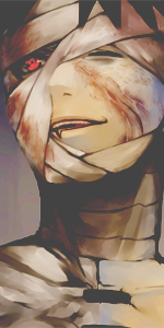
- the lighting has been messed up, the entire signature is very dark and Batman is quite bright without any kind of light source
- The text should have been placed closer to the vocal, at the moment it is so far off that the text almost became a second vocal
- there is a lack of flow due to how dark the signature is, almost all the details in the BG have dissapeared leaving only a couple of small light spots

It's a simple tag, so there's really no CnC left that hasn't been said.
I am not a big fan of it, here is some CnC:
- the lighting has been messed up, the entire signature is very dark and Batman is quite bright without any kind of light source
- The text should have been placed closer to the vocal, at the moment it is so far off that the text almost became a second vocal
- there is a lack of flow due to how dark the signature is, almost all the details in the BG have dissapeared leaving only a couple of small light spots


Well i'll add few words myself 
The signature is monotonous,it lack colors and crisp.You messed up with darkening ,let's take bat's head or left side of the tag,which is nother more than a dark space(that goes for more than half of the signature).
Nevertheless it was a good attempt hmm
The signature is monotonous,it lack colors and crisp.You messed up with darkening ,let's take bat's head or left side of the tag,which is nother more than a dark space(that goes for more than half of the signature).
Nevertheless it was a good attempt hmm
Awards
Thanks for your CnC . It is indeed a simple tag and some of the things you said are true.I am not a big fan of it, here is some CnC:
- the lighting has been messed up, the entire signature is very dark and Batman is quite bright without any kind of light source
- The text should have been placed closer to the vocal, at the moment it is so far off that the text almost became a second vocal
- there is a lack of flow due to how dark the signature is, almost all the details in the BG have dissapeared leaving only a couple of small light spots
Although, let me explain some stuff. Firstly, the point is the theme to be dark. Batman, as you can see, is the "focal" point of the sig. The background is dark, and the purpose is to fade the details in that darkness. (Only a small part) The lightning yeah, I just added a bit more lightning to the focal than it really needed. If the text would have been place closer to the focal, then it would leave the left part empty, and a text in the sides is also an alternative.
Last edited:
Thanks for your CnC . It is indeed a simple tag and some of the things you said are true.
Although, let me explain some stuff. Firstly, the point is the theme to be dark. Batman, as you can see, is the "focal" point of the sig. The background is dark, and the purpose is to fade the details in that darkness. (Only a small part) The lightning yeah, I just added a bit more lightning to the focal than it really needed. If the text would have been place closer to the focal, then it would leave the left part empty, and a text in the sides is also an alternative.
Yes, the point of the signature was to be dark, but the flow is broken due to the signature being too dark. The details aren't faded in the darkness. Those details are black. There's a difference between dark and black.
Text on the sides is not an alternative (text that you actually have to read I mean). If it left the left side empty, then find other ways to fill it. The text is creating another focal point.
I understood the idea, but there is a big difference between having an idea and actually pulling it off...Thanks for your CnC . It is indeed a simple tag and some of the things you said are true.
Although, let me explain some stuff. Firstly, the point is the theme to be dark. Batman, as you can see, is the "focal" point of the sig. The background is dark, and the purpose is to fade the details in that darkness. (Only a small part) The lightning yeah, I just added a bit more lightning to the focal than it really needed. If the text would have been place closer to the focal, then it would leave the left part empty, and a text in the sides can is also an alternative.
I didn't wanted to put it this way, but to make it clear, from a technical perspective this entire signature is a giant mess.
- The only decent thing is the blending but that isn't too hard if 50% of your signature is a shade of black.
- I wasn't speaking about the lighting which you added yourself, I was speaking about the lighting of the render itself.
You should add extra light sources in the BG to make it match with the render. - Maybe the text at a side is ok, if your focal point is next to it. Otherwise you get horrible results like
You must be registered for see links.
- If you need text to fill up your signature, it means that you have a really empty signature.
Awards
LOL. Boy, this is black.Yes, the point of the signature was to be dark, but the flow is broken due to the signature being too dark. The details aren't faded in the darkness. Those details are black. There's a difference between dark and black.
Text on the sides is not an alternative (text that you actually have to read I mean). If it left the left side empty, then find other ways to fill it. The text is creating another focal point.
You must be registered for see images
And the text doesn't always have to be stuck within the focal.
OK, so this was not my best shot, but some things about your CnC were off. Not going to argue about that anymore.I understood the idea, but there is a big difference between having an idea and actually pulling it off...
I didn't wanted to put it this way, but to make it clear, from a technical perspective this entire signature is a giant mess.
- The only decent thing is the blending but that isn't too hard if 50% of your signature is a shade of black.
- I wasn't speaking about the lighting which you added yourself, I was speaking about the lighting of the render itself.
You should add extra light sources in the BG to make it match with the render.- Maybe the text at a side is ok, if your focal point is next to it. Otherwise you get horrible results like
You must be registered for see links.- If you need text to fill up your signature, it means that you have a really empty signature.
Last edited by a moderator:


