You are using an out of date browser. It may not display this or other websites correctly.
You should upgrade or use an alternative browser.
You should upgrade or use an alternative browser.
[Photoshop] banner
- Thread starter Marcuss
- Start date
More options
Who Replied?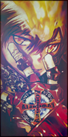


- Joined
- Mar 14, 2012
- Messages
- 10,361
- Reaction score
- 1,368
Well, it is nice and clean BUT:
- too dark. Needs a light source. There in the back you could've worked more and make it as a light source as I've said;
- The text doesn't fit in my opinion. It is too techniqual for this type of character. It would suit a banner with robots maybe;
- The Sasuke render and the rest of the banner looks like they are from totally another world. Try to make them all the same colour so overall will look like the same piece.
Overall it looks nice though. Work more on those details and I'm sure next time it'll get better! ^.^

- Joined
- Feb 14, 2012
- Messages
- 2,044
- Reaction score
- 240
In my opinion, blueish theme doesn't fit with purple render, I'd suggest you to find another one; check out bakarenders or renders-graphiques. Also, I'd put "Kaizokuden" text on the left bottom side of the banner and "Darkness of Sasuke" put a bit lower down on the border. I'd also remove that outer glow (if i'm seeing right) from the text or just change the color to blue or something dark.
Dark Clouds
Member
- Joined
- Jul 30, 2012
- Messages
- 419
- Reaction score
- 23
I think it looks pretty cool! ")

- Joined
- Jan 6, 2010
- Messages
- 2,863
- Reaction score
- 310
The purple sasuke doesn't really match the background. try to find another sasuke image that actually is a bit darker blue and matches the background. Or photoshop the sasuke and change his purplish appearance to bluish.

- Joined
- Feb 24, 2012
- Messages
- 2,037
- Reaction score
- 237
what site?

- Joined
- Nov 8, 2010
- Messages
- 2,488
- Reaction score
- 228
It's nice.