Banner - Project Bleach

Grim

Active member
Veteran
Joined
Feb 17, 2010
Messages
4,493
Kin
1💸
Kumi
0💴
Trait Points
0⚔️
Awards
Here's the banner I've been working on for a contest. Nothign to special though.

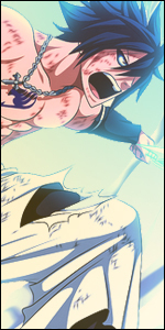
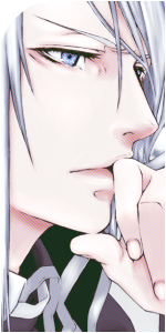
I had to render most of those renders myself, extended stock background of Hueko Mundo and used self made Garganta from previous Ulqu-Urahara signature.

One may say it lacks effects but the idea was to make it look simple and realistic as it is. Family photo :eek:

You must be registered for see images


unfixed v.
You must be registered for see images


C&C's and suggestions are welcome, still working on it and hope to make it even better!

Cheers

Direct link :

Blizz thinks this one is the best.... meh
You must be registered for see images
 
Last edited:

Grim

Active member
Veteran
Joined
Feb 17, 2010
Messages
4,493
Kin
1💸
Kumi
0💴
Trait Points
0⚔️
Awards
Trust me I am not, when this happens you should crumble the work, aim for the recycle bin and throw it straight into it. Then Start fresh. U_U
mate, I'm sure this one is better than previous one. I will add it here.. let's see what others think :3 I will make 3d one aswell. we need white theme also. But I can't find my psd's of early bleach signatures :(
 

Blizzàrd1

Active member
Legendary
Joined
Sep 13, 2010
Messages
13,534
Kin
0💸
Kumi
0💴
Trait Points
0⚔️
Awards
mate, I'm sure this one is better than previous one. I will add it here.. let's see what others think :3 I will make 3d one aswell. we need white theme also. But I can't find my psd's of early bleach signatures :(
Make something with a purplish-white color combination. That will suit better for the purpose you are making it.
 

Mikoto

Member
Joined
Sep 5, 2012
Messages
133
Kin
0💸
Kumi
0💴
Trait Points
0⚔️
Your type is a little too visually complex. I'd think about using a simple gradient instead of a texture. I'd also remove the double border. The type in your other signature works better because it's simpler and easier to read. I noticed ( I don't read Bleach so I don't know the characters) that the little dude in green with his hand up on the left is tangent to the "B" I'd move him to the left or right more so that he's not lined up with the edge. Color-wise the palette you chose is pretty good. It's a simple analogous color scheme and the proportion of darks to lights is working pretty well. The composition of the characters is nice. Good job overall.
 

Grim

Active member
Veteran
Joined
Feb 17, 2010
Messages
4,493
Kin
1💸
Kumi
0💴
Trait Points
0⚔️
Awards
Your type is a little too visually complex. I'd think about using a simple gradient instead of a texture. I'd also remove the double border. The type in your other signature works better because it's simpler and easier to read. I noticed ( I don't read Bleach so I don't know the characters) that the little dude in green with his hand up on the left is tangent to the "B" I'd move him to the left or right more so that he's not lined up with the edge. Color-wise the palette you chose is pretty good. It's a simple analogous color scheme and the proportion of darks to lights is working pretty well. The composition of the characters is nice. Good job overall.
thanks, but I personaly find text good and don't see good reason to simplify it :D you remind me of my boss. anyways, I do it mostly for self improvement not for show off.

lol at ''this little dude'' I will move him. Actualy it's a girl and originaly she looks like that
You must be registered for see images
 
Top