- Joined
- Sep 30, 2010
- Messages
- 8,257
- Reaction score
- 707
Well, I'd like a Kuroko no Basuke avy+sig.
Stock/Renders in order of my preference (that is, from most liked to least like)
NOTE: I don't want you to use Kise, Aomine and Momoi.
Rules, Specifications & What you need to know
- You may use any of the above render/stock. It's up to you; without imposing any specific style on you.
- I don't like Black & White Signatures. And I don't like Pop-Out Sigs.
- Avy size: 150 x 300. That being said, if someone makes me both a 150x200 & a 150x300 avy, that'll be awesome.
- There's no size limit on my sig but I don't want a wallpaper as as my sig. I want something that reasonably looks like a sig.
- I don't like Scanlines at all. But I'm okay with fractals, C4Ds and other shitz.
- If you want to add text on sig or even avy, add my name 'Escorpiius' [You better not misspell it]. But text is no obligatory fulfillment.
- If you're not good with text, do me favor and don't bother adding any text to potentially ruin it.
- You may choose same picture for both sig & avy or you may choose different ones. It's optional; though I'd prefer if, same characters were used for both sig/avy.
- Thanks and I hope some great stuffs. Be warned that I've usually been showered with pretty great GFX gifts; so I'm quite picky. Do your best")
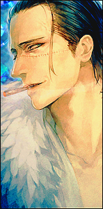
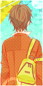
Stock/Renders in order of my preference (that is, from most liked to least like)
You must be registered for see images
NOTE: I don't want you to use Kise, Aomine and Momoi.
You must be registered for see images
You must be registered for see images
You must be registered for see images
You must be registered for see images
You must be registered for see images
You must be registered for see images
You must be registered for see images
You must be registered for see images
You must be registered for see images
You must be registered for see images
You must be registered for see images
You must be registered for see images
You must be registered for see images
Rules, Specifications & What you need to know
- You may use any of the above render/stock. It's up to you; without imposing any specific style on you.
- I don't like Black & White Signatures. And I don't like Pop-Out Sigs.
- Avy size: 150 x 300. That being said, if someone makes me both a 150x200 & a 150x300 avy, that'll be awesome.
- There's no size limit on my sig but I don't want a wallpaper as as my sig. I want something that reasonably looks like a sig.
- I don't like Scanlines at all. But I'm okay with fractals, C4Ds and other shitz.
- If you want to add text on sig or even avy, add my name 'Escorpiius' [You better not misspell it]. But text is no obligatory fulfillment.
- If you're not good with text, do me favor and don't bother adding any text to potentially ruin it.
- You may choose same picture for both sig & avy or you may choose different ones. It's optional; though I'd prefer if, same characters were used for both sig/avy.
- Thanks and I hope some great stuffs. Be warned that I've usually been showered with pretty great GFX gifts; so I'm quite picky. Do your best