You are using an out of date browser. It may not display this or other websites correctly.
You should upgrade or use an alternative browser.
You should upgrade or use an alternative browser.
Avatars + Tag
- Thread starter Fex
- Start date
More options
Who Replied?
- Joined
- Jun 11, 2014
- Messages
- 15,599
- Reaction score
- 985
Nice job.
They are good <3
They are good <3

- Joined
- Mar 14, 2014
- Messages
- 1,679
- Reaction score
- 305
that shit is garbage! rofl! jk, they're all very nice
Hamburger ( ͡° ͜ʖ ͡°)
Nice job. They are good <3
Didn't know you came back lol thanks anyways ")

- Joined
- Oct 27, 2012
- Messages
- 16,506
- Reaction score
- 1,135
Sick work in the middle avatar!!
The tag is first and foremost, really huge for a tag. I know it doesn't matter, but I am used to seeing smaller stuff generally. Now, the tag itself, has a very nice render choice, but the place where you put the shade, is just....right in the center of the work. It is usually meant to pop up, and not hide. The text is not bad, though still, I would suggest mixing up more than one font, and give it a more classy look. The background is not bad, the colors and not bad either, they just kinda seem out of place. Should have tried something...more fitting, mage thing ect ect ect...
The tag is first and foremost, really huge for a tag. I know it doesn't matter, but I am used to seeing smaller stuff generally. Now, the tag itself, has a very nice render choice, but the place where you put the shade, is just....right in the center of the work. It is usually meant to pop up, and not hide. The text is not bad, though still, I would suggest mixing up more than one font, and give it a more classy look. The background is not bad, the colors and not bad either, they just kinda seem out of place. Should have tried something...more fitting, mage thing ect ect ect...
- Joined
- Mar 14, 2014
- Messages
- 1,679
- Reaction score
- 305
Sick work in the middle avatar!!
The tag is first and foremost, really huge for a tag. I know it doesn't matter, but I am used to seeing smaller stuff generally. Now, the tag itself, has a very nice render choice, but the place where you put the shade, is just....right in the center of the work. It is usually meant to pop up, and not hide. The text is not bad, though still, I would suggest mixing up more than one font, and give it a more classy look. The background is not bad, the colors and not bad either, they just kinda seem out of place. Should have tried something...more fitting, mage thing ect ect ect...
I can see what you're saying.
- Joined
- Apr 22, 2014
- Messages
- 24,294
- Reaction score
- 3,330
Very, very good!

- Joined
- Mar 14, 2014
- Messages
- 1,679
- Reaction score
- 305
You must be registered for see images
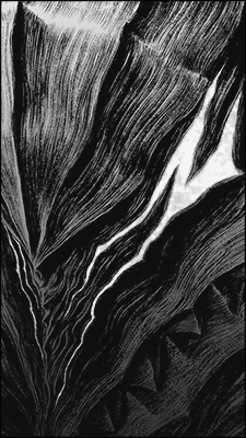
I love this:
It will look ugly as an avatar.

- Joined
- May 1, 2013
- Messages
- 25,124
- Reaction score
- 1,644
It will look ugly as an avatar.
I know I tried XD

- Joined
- Mar 12, 2014
- Messages
- 4,211
- Reaction score
- 568
absolutely love all the ava's and the sig!