[Photoshop] Avatars, or is it dem Avy's ;) ?

-R-

Jōnin Strategist 🧠
Regular
Joined
Jun 1, 2013
Messages
1,419
Reaction score
264
Its not that good :|


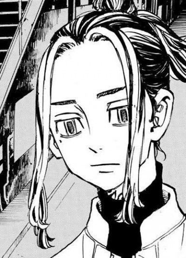
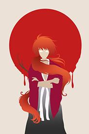
Anyways................. I didn't use that much of adjustments on these avys, but they came out pretty good.


But hey ! Am not the judge, you are.


Free to take..... But please post if you're gonna take/save ! And................. Yeah............ Thank you !

You must be registered for see images


I left this on a different spoiler cause it wasn't that good.... But hey ! If you liked it you can take it !

You must be registered for see images

And yeah.................. Why do I repeat my words ?????


If you have a C&C, dont be shy and share it !
 

Clouds

Anbu Operative 🎭
Veteran
Joined
May 12, 2013
Messages
4,004
Reaction score
366
Totally dem avys bro:cool:

Especially the snow harpie girl who's name i forgot ._.
 

- J AV -

Sannin of the Scrolls 📜
Elite
Joined
May 4, 2012
Messages
5,805
Reaction score
652
Not bad.... God of war avy is good..
Who is in second ava
 

Saikyokami

Kage in the Making 👑
Legendary
Joined
Dec 11, 2012
Messages
16,811
Reaction score
943
You must be registered for see images

Mejores tbh
 

Blunt

Anbu Operative 🎭
Veteran
Joined
Oct 28, 2011
Messages
4,498
Reaction score
371
Totally dem avys bro:cool:Especially the snow harpie girl who's name i forgot ._.
Monet from Punk Hazard arc .Nice job OP
 
Last edited:

Osmon

Kage in the Making 👑
Legendary
Joined
Oct 25, 2012
Messages
12,522
Reaction score
328
All Of Them Are Amazing Especailly That Caesar One :shororororo:
 

-S-

Legendary Shinobi 🐸
Immortal
Joined
Jan 16, 2011
Messages
41,396
Reaction score
2,409
Ironically, the one in the spoiler, which you think isn't good, is the best.

Why? It doesn't have any crappy black borders, and it's full of colour. Colour is so important.
 

Third Sage

Jōnin Strategist 🧠
Veteran
Joined
Feb 14, 2012
Messages
2,044
Reaction score
240
Astronaut one looks great although it's stock-made.
 

BazzBee

Kage in the Making 👑
Legendary
Joined
Mar 11, 2013
Messages
14,587
Reaction score
1,222
Ironically, the one in the spoiler, which you think isn't good, is the best.

Why? It doesn't have any crappy black borders, and it's full of colour. Colour is so important.

lololololol this ^
 

Titania Erza

Anbu Operative 🎭
Veteran
Joined
Mar 15, 2012
Messages
3,726
Reaction score
690

  • The first one has a very low quality and could use a little bit of blending and it needs a lightsource since Kratos has some shadows on his head.
  • The second one has been oversharpened at certain points (mostly the hair).
  • I dont have a lot to say about the third one, it looks good, but yeah I dont know what kind of render/stock you worked with.
  • The fourth one... more or less everything. The render is horrible (it has a lot of white on the sides and low quality), no blending at all, no lightsource while the render has shadows on it. The BG doesnt fit at all with the render and I could note some more things, but that will be way too long to explain and since what I already said are lacking, it is natural for some other thing to be lacking as well.
  • The fifth one isnt that bad at all compared to number 1,2 and 4.
So yeah, this is how you could have done it better:

Avatar 1:
- to increase the quality you can use the option "sharpen"
- for more blending use the eraser tool and use the soft eraser to erase around the edges, that is the easiest way for better blending.
- adding a lightsource: use a white colored soft brush and brush somewhere outside the canvas to create a lightsource. Do keep in mind that the placement need to match with shadows on the focal
Avatar 2:
- If you used the sharpen option, the easiest way to solve oversharpening is to first duplicate the entire image before sharpening it (crtl+alt+e) and then sharpen it. After sharpeneing it, use a soft eraser to erase the oversharpened parts
Avatar 4:
- to start of never use a render which is low quality, especially when you see that there is a lot of white covering the edges of the render. If you do, you have to erase the white parts yourself before doing any edits, otherwise it will look very bad
- as for blending/lightsource see the tips which I gave for avatar 1
- for the background, you can do two things. 1: use/create a BG which does fit with the render or you can make it fit with the render. If you want to do the later, an easy way is too add a gradient map so that it will match or you could change the hue


I think that this is sufficient CnC for the time being :)
 
Top