You are using an out of date browser. It may not display this or other websites correctly.
You should upgrade or use an alternative browser.
You should upgrade or use an alternative browser.
[Photoshop] Avatars ._. ._. ._. ._. ._. ._. ._. ._. ._. ._. ._.
- Thread starter -R-
- Start date
More options
Who Replied?
- Joined
- Mar 13, 2010
- Messages
- 16,212
- Reaction score
- 1,556
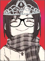
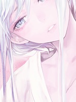
For the second one, the face is too blurry


- Joined
- Jun 1, 2013
- Messages
- 1,419
- Reaction score
- 264
No, the render was like this U_UFor the second one, the face is too blurry
- Joined
- May 29, 2013
- Messages
- 13,123
- Reaction score
- 692
You must be registered for see imagesYou must be registered for see images
these 2 are TOOOO CUTE! Especially the 2nd one , its so...


- Joined
- Mar 11, 2013
- Messages
- 14,587
- Reaction score
- 1,222
Okay i would say they're awesome, if i wanted to lie to you that is.
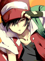
The first on seems LQ try picking High quality renders and consider that a must, and the render is the only thing showing in the avatar, try zooming it out.
The second avatar is far by the best out of all of em, though its blurry which makes it annoying, again always ise HQ renders, this one would hit my liking only if it weren't for the blur.
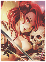
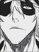
The third one... just terrible, the render absolutely doesn't match the BG, Imagining Rukia and then the colorful BG ruins the specialty and its too LQ and zoomed in, this one imo was just plain terrible.
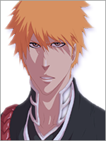
As for the last one... sigh the shadow on the render is just sooo annoying, and the BG again doesn't match.
Here let me lend you on some tips.
Its not like theres only one way of making an avatar, no there are countless, everybody has their own for example some like to make a wall with cds covering the render and all then crop it into avatar like.
Its not that the colorful background do not match, its upto you to make it match, and as i can see you have potential, try playing around a bit with avatars use different tools until you get what you want, It all depends on your creativity.
The things you seem shabby at are
Gradient maps
Blending
Render placing
Picking of renders
and try borders as well, if you don't know how to do that then its easy
-Create a new layer above all.
-Edit > Stroke > 1px (pick the color) > apply
that's all, which help alot though some people prefer dotted border over black full borders and some prefer dashed and some prefer a 2px white stroke which is overlayed with a 1px black stroke, to sum it all up its all about creativity.
Take some time on your avatars seeing as your new to GFX'ing take the time you need and don't rush.
Mind the spelling mistakes, my keyboard's ****ed up.
The first on seems LQ try picking High quality renders and consider that a must, and the render is the only thing showing in the avatar, try zooming it out.
The second avatar is far by the best out of all of em, though its blurry which makes it annoying, again always ise HQ renders, this one would hit my liking only if it weren't for the blur.
The third one... just terrible, the render absolutely doesn't match the BG, Imagining Rukia and then the colorful BG ruins the specialty and its too LQ and zoomed in, this one imo was just plain terrible.
As for the last one... sigh the shadow on the render is just sooo annoying, and the BG again doesn't match.
Here let me lend you on some tips.
Its not like theres only one way of making an avatar, no there are countless, everybody has their own for example some like to make a wall with cds covering the render and all then crop it into avatar like.
Its not that the colorful background do not match, its upto you to make it match, and as i can see you have potential, try playing around a bit with avatars use different tools until you get what you want, It all depends on your creativity.
The things you seem shabby at are
Gradient maps
Blending
Render placing
Picking of renders
and try borders as well, if you don't know how to do that then its easy
-Create a new layer above all.
-Edit > Stroke > 1px (pick the color) > apply
that's all, which help alot though some people prefer dotted border over black full borders and some prefer dashed and some prefer a 2px white stroke which is overlayed with a 1px black stroke, to sum it all up its all about creativity.
Take some time on your avatars seeing as your new to GFX'ing take the time you need and don't rush.
Mind the spelling mistakes, my keyboard's ****ed up.
Last edited:


- Joined
- Sep 26, 2012
- Messages
- 12,510
- Reaction score
- 418
Okay i would say they're awesome, if i wanted to lie to you that is.
The first on seems LQ try picking High quality renders and consider that a must, and the render is the only thing showing in the avatar, try zooming it out.
The second avatar is far by the best out of all of em, though its blurry which makes it annoying, again always ise HQ renders, this one would hit my liking only if it weren't for the blur.
The third one... just terrible, the render absolutely doesn't match the BG, Imagining Rukia and then the colorful BG ruins the specialty and its too LQ and zoomed in, this one imo was just plain terrible.
As for the last one... sigh the shadow on the render is just sooo annoying, and the BG again doesn't match.
Here let me lend you on some tips.
Its not like theres only one way of making an avatar, no there are countless, everybody has their own for example some like to make a wall with cds covering the render and all then crop it into avatar like.
Its not that the colorful background do not match, its upto you to make it match, and as i can see you have potential, try playing around a bit with avatars use different tools until you get what you want, It all depends on your creativity.
The things you seem shabby at are
Gradient maps
Blending
Render placing
Picking of renders
and try borders as well, if you don't know how to do that then its easy
-Create a new layer above all.
-Edit > Stroke > 1px (pick the color) > apply
that's all, which help alot though some people prefer dotted border over black full borders and some prefer dashed and some prefer a 2px white stroke which is overlayed with a 1px black stroke, to sum it all up its all about creativity.
Take some time on your avatars seeing as your new to GFX'ing take the time you need and don't rush.
Mind the spelling mistakes, my keyboard's ****ed up.
Look at you Madara3Uchiha xD
- Joined
- Mar 11, 2013
- Messages
- 14,587
- Reaction score
- 1,222