Assassin's Creed Signature
- Thread starter LitzSabr
- Start date
More options
Who Replied?

Awards


Loki Helcast
Member

Yes the first game was with themdo you know assassin is iranian group named "hashashin"?

Awards
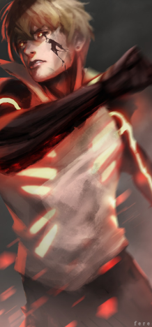
Preach for Ezio Auditore Da Firenze.
^ If it's about the new game, then it's not a character from it. Giovanni is Ezio's father.just heard about it, do we know who the assassin is yet?
Yes, I have heard about the Hashishin. Not sure if they were really iranian, may be they were.do you know assassin is iranian group named "hashashin"?
Last edited:

Awards
Nice work with the smoke fractals/normal fractals, or whatever you worked with, I like this outcome a lot ^^

Awards
ThanksNice work with the smoke fractals/normal fractals, or whatever you worked with, I like this outcome a lot ^^

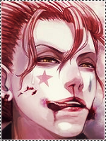
Did some update on the bg. And thanks for the CnCEffects are cool, depth is nice but i hate that its just red...more colours please, also wayyyy too dark in the bg...keep it up tho


Awards
everyone latching onto the same CnC, I feel like only NB does that ~_~. Honestly, having it all red for a sig like this isn't too bad. You could also argue that it's red/white. What you should do it just cut out the entire right side so that there's barely space next to the text. This way the sig looks a lot more "full" so to speak and will look really nice. I love what you did with this sig to be honest, it's a bit unique but still really good. Probably my favorite from you so far Keep it up man, you're getting a lot better.
Keep it up man, you're getting a lot better.
Awards
Render blends well with the signature. But, I see too much red, which hurts my eyes. ;_;
Its cool but its only red . I know LitzSabr you can do much better .
With this render, I wanted to give it a cooling red effect. I'l try not to get too monotonous if it won't fit the render. And thanksNice Signature but reddish 0_0
Thanks man. Although I wouldn't cut the right side away. Render placement and the dimensions themselves won't look that good.everyone latching onto the same CnC, I feel like only NB does that ~_~. Honestly, having it all red for a sig like this isn't too bad. You could also argue that it's red/white. What you should do it just cut out the entire right side so that there's barely space next to the text. This way the sig looks a lot more "full" so to speak and will look really nice. I love what you did with this sig to be honest, it's a bit unique but still really good. Probably my favorite from you so far
Last edited: