You are using an out of date browser. It may not display this or other websites correctly.
You should upgrade or use an alternative browser.
You should upgrade or use an alternative browser.
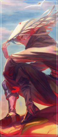
[Photoshop] Anime girl Signaturee
- Thread starter Chihaya
- Start date
More options
Who Replied?

- Joined
- May 23, 2014
- Messages
- 2,304
- Reaction score
- 195
Chiya you bum you lied

- Joined
- Jun 11, 2014
- Messages
- 2,945
- Reaction score
- 403
I like the graphic design elements and the color scheme.
- Joined
- Apr 10, 2014
- Messages
- 4,185
- Reaction score
- 1,162
Chiya you bum you lied
I lied? lol.. ??


- Joined
- Jun 15, 2014
- Messages
- 1,654
- Reaction score
- 80
it's good , good job (Y)
- Joined
- May 23, 2014
- Messages
- 2,304
- Reaction score
- 195
Yesh you know what im talking aboutI lied? lol.. ??

- Joined
- Jun 11, 2014
- Messages
- 2,945
- Reaction score
- 403
I tried to make one too, but you're so much better than me at graphic design.

You must be registered for see images

- Joined
- Jun 3, 2011
- Messages
- 5,571
- Reaction score
- 444
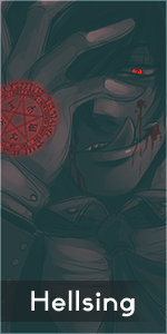
nice work, i really like it :hooray: the only thing that i don't like is the fractal on the left side, to me it just stands out too much


- Joined
- May 26, 2012
- Messages
- 14,626
- Reaction score
- 1,665
Opinions please, I made it.
Well if you didn't, you're not allowed to post here at all

Anyway, where to begin.
Well i'll be honest when i say the text is rather nice. However not sure the rest of the tag is, as the sharp blood and grunge brushes stands out too much for me. I don't know, maybe i just don't like brushes in signatures at all or i just want them to blend perfectly. Well i feel as these stand out way too much. Infact soo much that each individual brush becomes a focal. So yeah, if you want to keep those brushes sistaah, you need to work that depth with blur/sharpening tools. Or else i will point my eyes everywhere on this tag and scratch my head in hopes of figure something out.
I like the boldness of which you didn't put the render in the middle which is classic. However if you put it on the side, there's gotta be a flow on the other side that matches the render/focal. Well in most cases of tags the main render is the focal so.. Duh. The blending is existing but it.. sucks.. You can't just throw fractals randomly on different oppac settings and hope for the best. Noh, you gotta use lightning tools, depth tools, C4D's and fractals perfectly together to make a nice blending. Does this tag have a focal? Well it's obviously the render, but the fact that the text is beside the render and some of the brushes are so sharp. Makes room for plenty of focals, i don't like that. I don't like the border either, it's boring and doesn't suit the color standards(who are infact pretty decent in this tag yo).