You are using an out of date browser. It may not display this or other websites correctly.
You should upgrade or use an alternative browser.
You should upgrade or use an alternative browser.
A tag ._.
- Thread starter -R-
- Start date
More options
Who Replied?


- Joined
- Oct 3, 2012
- Messages
- 551
- Reaction score
- 17
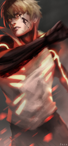
looks Nice but that white thing above and below texts,, kinda ruin it,,,,
This^
") it is good besides the stuff above and below the writing
it is good besides the stuff above and below the writing 
Raiin
Member
- Joined
- Dec 29, 2012
- Messages
- 489
- Reaction score
- 67
I really like the color scheme, but the text is not blended well, and they are too far spaced from one another. I'm not the best at text, but try putting it near the focal point next time and use the eyedropper to select similar colors from the sig itself, so that the text blends evenly.


- Joined
- Sep 26, 2012
- Messages
- 12,510
- Reaction score
- 418
Remove the text bro U_U

- Joined
- Feb 14, 2012
- Messages
- 2,044
- Reaction score
- 240
It seems you really hurried to get this one done.