*Skorm, the CnC master arrives*
I see, you've improved >_____O.
YAY!!
I've highlighted parts that need a second round of editing, if ever go back and improve your works..
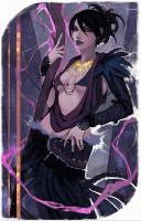
You must be registered for see images
Let's start.
1.
Needs more dynamic feeling here. Some parts of the greens, should either have a touch of vignette. Saying they should gradually
get a bit darker around their left edge. Giving the feeling of a vignette, or you just make a layer over all layers. Take a big black soft brush, set it on soft light/hard light(W/E fits the best).
It should also be blurred a lot more. It's to sharp, so there's no feeling of depth here. You either highlight the area with the RMT(Rectangular Marquee Tool). Cut the C4D(or w/e it is) and out it on Gaussian Blur. Select a good strength of it. Not to blurry either, so it feels extremely far away. That can also make the tag undynamic.
It also applies on a area straight under the 1. Where there's a green sorta thing, coming in from outside the frame. I didn't highlight it, cause it needs the same touch as the 1. I'm just kidding, I've forgotten to highlight it. Noticed it just now xd. . .
2.
To messy, and looks kinda lq. Blur it, or remove the effect and put something smoother there. Doesn't quite fit in the rest of the tag, as the rest seems more relaxed. It also provided a sorta messy green overlay on the render. Yeah.. remove it, doesn't fit in _O
k xD
ill do that
3.
The border is placed
one pixel to high. Lower it, so it falls into the right place. xd
erm...ok o-o
4.
Needs more blur there. I also suggest it to be a good spot to blend the render more with the background. Put a green/cyan/black C4D there and blend it together nice. With some blur effects ofc. Don't want to make it as sharp as the major focal, now would we
 hmmm..i see..awesome advice der
5.
Text is.. Horrible
.. Gives the feeling of very low quality, and it is kinda pixelated.. No no, here are some Skorm approved fonts U_U
You must be registered for see links
You must be registered for see links
You must be registered for see links
You must be registered for see links
You must be registered for see links
You must be registered for see links
You must be registered for see links
Download them >_O.
The text also needs more blending with the surroundings. If you'd have a light source, copy it, make a motion blur in a direction that goes over the ext, and bang. Good lightning blending right there, don't for get to put that on Linnear Colour Dodge though >_O.
Also, here is a good 3D text tutorial, which i've followed myself.
You must be registered for see links
The text was atleast good placed >_O
yeah..text..hates me..o-o
thanks for the skorm approved fonts :y
6.
Wtf is that blue? Hydrated bird **** or? xd. I suggest you cover that with a cyan light source on LCD(Linnear Colour Dodge)
HAHA wtf..i dont know how that got there...>__>..
7.
Why does it look like it's a reflection of a red/brown light on there? D=. I can't find a red/brown tint anywhere on the whole tag except there. It'd be ok, if it atleast had a slight tint of either cyan or green on it. Looks kinda disoriented colour speaking _O
ok :y
Overall, it has a good blending, and light is ok. Also hell i noticed just now when i looked on it again, at the point 1.. it's not blurred, but on the other side of the tag exactly the same C4D was applied. That one had blur on it.. Now that was cheap to use the exact same position of the same C4D on the same altitude on two sides D=
nah...it isnt a c4d..its part of the render...o-o...maybe i should erase it?