Hello today I'm showing off four of my drawings that I have draw.
OPS Do notice that scanner pretty much failed with these pics with means the shading got so bad -_- anyway... I guess I just pretty much shows them.
First: Armor
I am working pretty much with making characters wearing armors, with I can tell it's a heck of a work for me who is new to drawing arts. As well you can probably see the shading and grey coloring on his armor is not that nice (because of scan).
I do like how the arm armors got built up, pretty much simple built up 4 squares and just remade them. So I'm defiantly gonna continue with working with guide lines.
I do like the legs, because I pretty much tried to make an armor that protected the middle, later goes down to protect the sides of the legs but leaves it open for middle, so the person can move more 'freely'.
What I going to do is pretty much practice on Torso, helmet and hands.
His torso does still look flat and does not really carrying any details. Helmet is not even, I want to make his helmet more square like those "special" knights from Assassin creed : One, (Those with red crosses or something on the helmets).
This is about this picture, let's move on.
Second : Tank
I like working on drawing tanks, because I love the different views and shapes of it. The forms, etc turret form is built. I like to stick to WW2 (World War) I like their looks more than these days tanks (Probably something I got from WoT (World of Tanks). So yeah, I like working with tanks because it's so much math forms that can be used, with I find being a good way training with guide lines.
I do like the side of it, the turret and the little radio signal showing up on the turret.
What I could have done better is defiantly the wheels, the band that the wheels are "driving" on. And as well front & back of the tank.
The Canon is okay in my opinion.
The letter 'Z' stands for nothing. I just choose it because all tanks get named by letters or numbers, I choose letter 'Z' because it's not that many that use that letter xd
Let's move on to next picture.
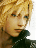
Third : Nagato
This picture became a disappointment because of the scan, as you can see the shading is SO bad now. Dark and as well you see all the lines...
This picture do look better on the 'original' paper itself with I like.
What I could have done better is defiantly putting more work to the hair, shading but as well the Rinnegan.
But I do like the way I made his body (Neck to clothes (shoulders).)
But yeah, shading and the hair is a disappointment now after the scan.
Let's move on to the last picture!
Last (Fourth) :
This is probably the best picture I have drew so far. Not because of the details itself. Because of I love that the picture is showing strong feelings. Pretty much a lonely girl, in shame. Hiding behind a door.
Looking at the 'original' one and the scan makes me disappointed because of the shading is so bad (like I have already said) but in the original one it's actually good. With makes everything so much better.
What I could have done better is the hair, I tried to make this "lightness" thingy on her hair. But I did put some of the lightness thingy on wrong places as well. But yeah, I love how this picture is actually acting.
This was the last picture that I had to show atm. Hope that you all enjoyed it.
So yeah, hope that you guys enjoyed it at least I do because I have the original papers that doesn't have any weird shading problems :ghehe:
Sorry 'bout that
OPS Do notice that scanner pretty much failed with these pics with means the shading got so bad -_- anyway... I guess I just pretty much shows them.
First: Armor
You must be registered for see images
I am working pretty much with making characters wearing armors, with I can tell it's a heck of a work for me who is new to drawing arts. As well you can probably see the shading and grey coloring on his armor is not that nice (because of scan).
I do like how the arm armors got built up, pretty much simple built up 4 squares and just remade them. So I'm defiantly gonna continue with working with guide lines.
I do like the legs, because I pretty much tried to make an armor that protected the middle, later goes down to protect the sides of the legs but leaves it open for middle, so the person can move more 'freely'.
What I going to do is pretty much practice on Torso, helmet and hands.
His torso does still look flat and does not really carrying any details. Helmet is not even, I want to make his helmet more square like those "special" knights from Assassin creed : One, (Those with red crosses or something on the helmets).
This is about this picture, let's move on.
Second : Tank
You must be registered for see images
I like working on drawing tanks, because I love the different views and shapes of it. The forms, etc turret form is built. I like to stick to WW2 (World War) I like their looks more than these days tanks (Probably something I got from WoT (World of Tanks). So yeah, I like working with tanks because it's so much math forms that can be used, with I find being a good way training with guide lines.
I do like the side of it, the turret and the little radio signal showing up on the turret.
What I could have done better is defiantly the wheels, the band that the wheels are "driving" on. And as well front & back of the tank.
The Canon is okay in my opinion.
The letter 'Z' stands for nothing. I just choose it because all tanks get named by letters or numbers, I choose letter 'Z' because it's not that many that use that letter xd
Let's move on to next picture.
Third : Nagato
You must be registered for see images
This picture became a disappointment because of the scan, as you can see the shading is SO bad now. Dark and as well you see all the lines...
This picture do look better on the 'original' paper itself with I like.
What I could have done better is defiantly putting more work to the hair, shading but as well the Rinnegan.
But I do like the way I made his body (Neck to clothes (shoulders).)
But yeah, shading and the hair is a disappointment now after the scan.
Let's move on to the last picture!
Last (Fourth) :
You must be registered for see images
This is probably the best picture I have drew so far. Not because of the details itself. Because of I love that the picture is showing strong feelings. Pretty much a lonely girl, in shame. Hiding behind a door.
Looking at the 'original' one and the scan makes me disappointed because of the shading is so bad (like I have already said) but in the original one it's actually good. With makes everything so much better.
What I could have done better is the hair, I tried to make this "lightness" thingy on her hair. But I did put some of the lightness thingy on wrong places as well. But yeah, I love how this picture is actually acting.
This was the last picture that I had to show atm. Hope that you all enjoyed it.
So yeah, hope that you guys enjoyed it at least I do because I have the original papers that doesn't have any weird shading problems :ghehe:
Sorry 'bout that
Last edited:
")