I'll give you CnC, since you asked for it then :shrug:
Picture one:
Things i didn't like:
1: There are flaws here and there in the lightning. Look on her dress/whatever. It's reflected with white colour, but your bg has a to strong blue light source. Fix that with a blue brush on soft light. OR you make a white light source that is connected to her reflection points that demands a white source. OR you burn out the reflections entirely, but i do not recommend that.
2: The text; i don't like the easy way to kinda make it stand out with the blending options outer glow. No. You gotta make your own glow, with brushes and the like. The secound thing i don't like about it, is that it doesn't at all go with the flow your render has created. It goes in the opposite way of the flow, and should've been between that gun and her chest, rather in a corner. Not only does it now follow the flow, but it generates a new focal. Shall i focus on her, or the text? No, keep them at the same place, and don't create multiple focals.
3: I see that this is a pop-out signature. What you should've done is put the border of the signature on top of the gun that comes out of the signatures background, to make it blend even more.
4: Not much blending with the render. You should've put some abstract C4D's ontop of the render, to make it blend in even more. Also i think that the lightning from the gun, should have contact with the girls left shoulder(as seen right from viewer perspective). Fix that with blue soft light brushes aswell. Or even linear colour dodge like i do.
5(this'll be the last >_>):
I don't like how the render outglows from the background at the bottom of her skirt. It makes it look kinda cheap, and just has the opposite effect of blending.
Things i like about it:
1: Colours are nice ad goes well together, well duh any colour goes well with black..
2: Her gun's nice..
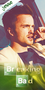
Picture two:
Things i don't like:
1: Well just look at it. It looks very lq, and at some places over sharpened.
2: The text, again doesn't go with the flow.
3: The randomness on his chest.. Just looks horrible :/
Things i like:
1: Colours are again good, and it has a better focal contrast than picture one..
2: The glass shards are not executed 100%, but they work.
3: Better blending than picture one, also better lightning.
")
