2 new signature's

Royal Uchiha

Leaf Village Regular 🍃
Regular
Joined
Mar 29, 2014
Messages
675
Reaction score
68
Hey guys

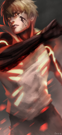
Yesterday and today I've been working on 2 signature's in the hope to improve my Photoshopping, rate please:

You must be registered for see images

Regards

P.S.: The font sucks I know, imagine it as it's not there.
 

Gintõki1

Sannin of the Scrolls 📜
Elite
Joined
Apr 11, 2014
Messages
8,016
Reaction score
974
Both look good, but my favorite is the second one.
 

EVlL

Anbu Operative 🎭
Veteran
Joined
Apr 5, 2014
Messages
3,936
Reaction score
204
great job! look cool but prefer the second one hehe:)
 

Masterpiece7

Anbu Operative 🎭
Veteran
Joined
Mar 13, 2014
Messages
3,435
Reaction score
103
Good job,keep training and you'll become good =)
 
Joined
Apr 11, 2012
Messages
429
Reaction score
39
2nd one is much better Ithink because the 1st one isnt as recognizable....also, maybe try stretching out the letters across the background of it (2nd one). Good job tho
 

Naruto.

Sage of Six Posts 🔮
Immortal
Joined
Feb 8, 2013
Messages
50,612
Reaction score
735
2nd one needs to blend more. Also, you could improve your text placement.
 
Top