2 Avatars

Gintõki1

Sannin of the Scrolls 📜
Elite
Joined
Apr 11, 2014
Messages
8,016
Reaction score
974
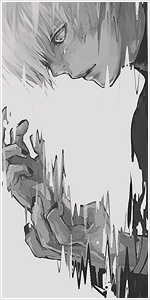
I made these 2 as a practice with lighting, darking and etc.
Hope you guys like it and cnc from the pros would be appreciated. :)


Avatars:


You must be registered for see images


Stocks:

You must be registered for see images
 

Xēnovia.

Sannin of the Scrolls 📜
Elite
Joined
Jan 24, 2012
Messages
5,867
Reaction score
440
I really like what you did with this one. Great work!
You must be registered for see images
 

R4mbl3

Anbu Operative 🎭
Veteran
Joined
Jul 1, 2012
Messages
2,547
Reaction score
291
I Like them a lot. But for some reason, I feel like Itachi's eyes are to red, That just my opinion though.

Good Job!
 

Mypower

Sannin of the Scrolls 📜
Elite
Joined
Dec 27, 2012
Messages
7,215
Reaction score
555
Can u make a Kakashi one for me please.
 

Gintõki1

Sannin of the Scrolls 📜
Elite
Joined
Apr 11, 2014
Messages
8,016
Reaction score
974
Pretty damn awesome :D

They are really great, especially Itachi one

Thank you both! :)

I really like what you did with this one. Great work!
You must be registered for see images

Glad you like it. :)

I Like them a lot. But for some reason, I feel like Itachi's eyes are to red, That just my opinion though.

Good Job!

Thank you for your cnc. :)

That's awesome bro :)

Thanks bro! :)

Can u make a Kakashi one for me please.

I will add a Kakashi one next time then, will let you know!
 

Jin

Legendary Shinobi 🐸
Supreme
Joined
Dec 22, 2012
Messages
21,037
Reaction score
1,304
Great as always Bro :)
But you know, the same story :'( (Can't rep you) :dead:
 

Yuse

Sannin of the Scrolls 📜
Elite
Joined
Apr 15, 2014
Messages
8,999
Reaction score
230
the itachi one is great
 

Hei

Supreme
Joined
Aug 22, 2011
Messages
23,898
Reaction score
1,601
The lightening is too strong,tt should go with the natural flow of the image.You see,on the second avatar the lighnening is really forced out of nover ,although i see what you were trying to achieve.
The problem of the first avatar is its focal point.Basically,all our attention goes with the light and less with Kuroyukihime's face and body.
Original stock is good but the work was done a bit in a wrong way.

All in all,not bad.My advise would be: look through the basic tutorials and use tips that are shown there in your art.When you reach certain level (for yourself) ,search something new and improve your skills.Ahh one more thing,keep trying ...just keep trying and eventually you will really improve.
 
Top