Let the CnC..BEGIN O_O
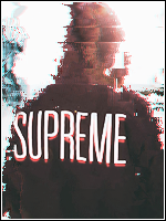
Alright first picture:
This is my favorite one, of the three. Incredible focal work, lightning and colors!
I am missing two things; a border and a text.
I'd like the text to be placed above his striking hand. Small text, but i kinda feel it'd be necessary >_O.
Another thing i'd like to add is that some parts of the render aren't quite as blended as other parts. Makes it slightly UN-dynamic <_O.
I think a border would make the tag better tbh, closes it in and then it feels fully finished..
Last thing. The beams of light should give a affect on the render, it feels like an effect that just is half-finished.
Picture two.
Good blending of colors, but i'm not sure i like all of them xd.
I see two focals, wich i don't like :/. The light on the left should either be a tad damped, blured or simply moved closer to the render. I suggest the last option there, as blurring isn't good-looking on a smudgie.
I also don't feel the render is as good blended as the first tag.
The light is something of a mystery, the left spotlight that i wanted you to moce closer makes up a blue light, directed to Master Chief's chest. However, his reflection isn't blue. It's yellow/green-ish. .
Picture three.
I can't really grasp how this is a smudgie xd.
Looks more like the style i use, but cheaper of effects and bla bla bla..
No, i sorta want to like this one, since you posted it along two great tags. But i don't

First thing i get annoyed by is the direction of the light, reflected on the renders visors. Looks like the light is coming in front of him, but your light source is placed right above him.. Hmm.. >_>
Overall background is pretty lq, though it is filled with action. I like that xd..
The logo w/e is kinda hard to read, lq, and should(if you really insist of using it) be placed WAY closer to the render >_O..
Meh, i'd like to continue, but i'm in a hurry..
Good job on first one!
Not AS good as the first one, but secound is nice too!
Third.. Not good..
Anyway, now i wanna get back to GFX:ing...
>_>
<_<
<_>
>_<