Dracule Mihawk
Member
- Joined
- Jan 31, 2012
- Messages
- 397
- Reaction score
- 268
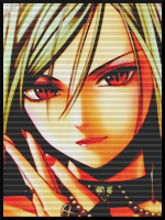
I was just playing around and got this result finally... i like it, what ya think?
You must be registered for see images


:/
Nope, didn't click this time..
For the reasons;
1: I kinda hate the small presences of cyan light right under her hair, makes it look un-blended and i'd prefered a darkening of the area around the parts and then maybe make some lightbolts around her..
2: Upper right corner looks terribly dead; add more shit there!
3: WTF happened with her right eyebrow? It looks like it's going to fly to outer space O_O
4: The black 1px thick border of the text.. It makes it looks very pix-elated and lq.. Either remove that or the text entirely..
5: Also text related.. The lighten up part in the word "FOX" where the light source is above the text but it's reflection of it is disorientated. Not really that important, but meh..
Things i like thus are the flow with the motion blur, and the overall colours has blended nice.