You are using an out of date browser. It may not display this or other websites correctly.
You should upgrade or use an alternative browser.
You should upgrade or use an alternative browser.
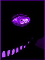
What do you Think of this pic i made :)
- Thread starter sindi1997
- Start date
More options
Who Replied?

- Joined
- Apr 9, 2012
- Messages
- 1,640
- Reaction score
- 238
looks cool alittle to dark imo
Now that i m looking at it your right O_O
Nicee job!
thanks bro ^_^

- Joined
- Oct 2, 2012
- Messages
- 2,082
- Reaction score
- 146
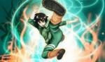
The concept is very nice
the only thing wrong you overdid it with effects , and i have no doubt that you have skills
Keep it a bit simple and Make the Colors/Chars Look Brighter
another comment , Dont squeeze the Pic so much .... it looks weird , and not catching the eye as you would want it to
But the concept - nice
the only thing wrong you overdid it with effects , and i have no doubt that you have skills
Keep it a bit simple and Make the Colors/Chars Look Brighter
another comment , Dont squeeze the Pic so much .... it looks weird , and not catching the eye as you would want it to
But the concept - nice

- Joined
- Jul 20, 2012
- Messages
- 12,448
- Reaction score
- 1,621
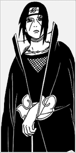
Pretty cool except the top part with Obito just looks like it's been added just to be added...basically it looks like two different pictures put together just for kicks!
Regardless it is fantastic work and well done!
Regardless it is fantastic work and well done!
- Joined
- Apr 9, 2012
- Messages
- 1,640
- Reaction score
- 238
i like the concept
thanks ^_^
The concept is very nice
the only thing wrong you overdid it with effects , and i have no doubt that you have skills
Keep it a bit simple and Make the Colors/Chars Look Brighter
another comment , Dont squeeze the Pic so much .... it looks weird , and not catching the eye as you would want it to
But the concept - nice
Thanks so much for the advice bro ^_^ Btw How did you make 523 post within 2 weeks O_O
It looks really cool! I think you should take the circle thing out though..kind of wrecks it..
I rate it 4 . 5 / 5
Thanks
- Joined
- Apr 21, 2011
- Messages
- 59,557
- Reaction score
- 4,729
I like it. If you made it lighter, it'd be better.

- Joined
- Jul 16, 2012
- Messages
- 5,504
- Reaction score
- 786
Looks very good, but Tobi is stretched xd
- Joined
- Apr 9, 2012
- Messages
- 1,640
- Reaction score
- 238
I like this...pretty cool what you did with the Uchiha symbol as well.
Thanks Bro
Pretty cool except the top part with Obito just looks like it's been added just to be added...basically it looks like two different pictures put together just for kicks!
Regardless it is fantastic work and well done!
thanks you here A ***** to show you my appriciation ^_^
- Joined
- Nov 8, 2012
- Messages
- 1,774
- Reaction score
- 241
Good..but can barely see it
- Joined
- Apr 9, 2012
- Messages
- 1,640
- Reaction score
- 238
I like it. If you made it lighter, it'd be better.
Thanks I ll make a lighter tomorrow
Looks very good, but Tobi is stretched xd
lol you noticed XD thanks bro
Good..but can barely see it
Thanks i ll make a brighter ver tomorrow

- Joined
- Oct 2, 2012
- Messages
- 2,082
- Reaction score
- 146
Thanks so much for the advice bro ^_^ Btw How did you make 523 post within 2 weeks O_O
Im an old member , I know the secrets
my other account was banned , cuz my Bro logged into NarutoBase from his PC
i tried contacting the admins , no use - oh well
