Got A Drawing Pad for Photoshop!!!

R4mbl3

Anbu Operative 🎭
Veteran
Joined
Jul 1, 2012
Messages
2,547
Reaction score
291
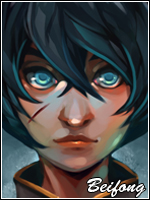
I have two versions of the same Sig.
Let me know what one you like more.
Also I did these with this new drawing pad. Its awesome and definately worth getting one.

You must be registered for see images


You must be registered for see images
 

~Dream~

Anbu Operative 🎭
Veteran
Joined
Mar 13, 2012
Messages
3,324
Reaction score
398
What's a drawing pad, I'm guessing it's like an Ipad and you can edit and GFX on it?

Godo job, I like both.
 

Spitfire421

Leaf Village Regular 🍃
Regular
Joined
Jun 29, 2012
Messages
678
Reaction score
156
I really love the second one! The colors, saturation, and contrast are wonderful! Keep up the good work! :D
 
Last edited:

Beifong

Kage in the Making 👑
Legendary
Joined
Aug 25, 2011
Messages
12,662
Reaction score
546
i don't like the second at all
(originality > creativity )
and for the first i think sasuke should be darker and you can make the render smaller with the regular shape by holding shift while making it smaller
 

Gary777

Anbu Operative 🎭
Veteran
Joined
Dec 7, 2011
Messages
3,230
Reaction score
250
:rofl: i know they r awesome for editing with :( but i dont have one ...
ur editzz look cool + rep 4 u dude
 

Trump Card

Banned
Regular
Joined
Aug 30, 2012
Messages
1,141
Reaction score
29
good, nice, its great, both are ugly and disgusting, and here's a +rep from me
 

IDunno

Banned
Joined
Sep 9, 2012
Messages
444
Reaction score
40
I like the first one though, but compare yours to my sig.
 

R4mbl3

Anbu Operative 🎭
Veteran
Joined
Jul 1, 2012
Messages
2,547
Reaction score
291
Thanks everyone. Im prolly going to be messing around in photoshop all night with this thing.
 

-Avenger-

Sannin of the Scrolls 📜
Elite
Joined
Jul 23, 2010
Messages
8,494
Reaction score
724
The render is not re-sized properly and the sig is LQ...and the text placement is not good.
 
Top