You are using an out of date browser. It may not display this or other websites correctly.
You should upgrade or use an alternative browser.
You should upgrade or use an alternative browser.
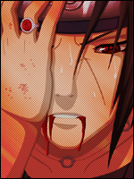
[Photoshop] Made this for contest on another site
- Thread starter Marcuss
- Start date
More options
Who Replied?


- Joined
- Feb 10, 2012
- Messages
- 9,529
- Reaction score
- 1,222
Wow that's awesome ^-^
rep+
rep+

- Joined
- Jul 5, 2012
- Messages
- 6,394
- Reaction score
- 795
It's really good.

- Joined
- Jul 12, 2011
- Messages
- 4,035
- Reaction score
- 142
That's ****ing amazing!
Seconded

naruto1414
Member
- Joined
- Jan 15, 2011
- Messages
- 346
- Reaction score
- 16
pretty damn good
Dark Clouds
Member
- Joined
- Jul 30, 2012
- Messages
- 419
- Reaction score
- 23
That's cool. + rep ")


- Joined
- Feb 17, 2012
- Messages
- 1,897
- Reaction score
- 723
Other than the chidori and the text what else did you do to it? sorry if I sound harsh here, but it looks rather plain and boring and tbh if its for a sig contest you will need to bring something a lot more exciting than this if you want to win it. There is no depth so it looks flat and its definitely lacking any sort of "wow" factor, try adding adjustment layers,effects(c4d's,fractals and what not) it just looks like a couple of renders pasted onto a background.

- Joined
- May 2, 2012
- Messages
- 1,487
- Reaction score
- 146
Other than the chidori and the text what else did you do to it? sorry if I sound harsh here, but it looks rather plain and boring and tbh if its for a sig contest you will need to bring something a lot more exciting than this if you want to win it. There is no depth so it looks flat and its definitely lacking any sort of "wow" factor, try adding adjustment layers,effects(c4d's,fractals and what not) it just looks like a couple of renders pasted onto a background.
only did other then the chidori n text was blending n light effects i wanted it to look as it came out of the show i thought adding more to it might of wrecked it and it wouldnt of turned out as nice

- Joined
- Feb 17, 2012
- Messages
- 1,897
- Reaction score
- 723
only did other then the chidori n text was blending n light effects i wanted it to look as it came out of the show i thought adding more to it might of wrecked it and it wouldnt of turned out as nice
Ok well you don't need to add heaps or else yes it will ruin it, but it definitely needs some more work when you add light to a sig then you need to balance it up with shading. Also the back of the background should be blurry to add depth(you can also use lighting and shading to achieve depth) and perhaps a fractal or 2 wouldn't go astray either, but don't just use the first fractal you see. Find some that blend well with your render and background and then use them to create some flow these are the 4 common basics in sig making blending,lighting,depth and flow. I have missed some but can't remember what they are of the top of my head lol anyways hope this helps.
- Joined
- May 2, 2012
- Messages
- 1,487
- Reaction score
- 146
Ok well you don't need to add heaps or else yes it will ruin it, but it definitely needs some more work when you add light to a sig then you need to balance it up with shading. Also the back of the background should be blurry to add depth(you can also use lighting and shading to achieve depth) and perhaps a fractal or 2 wouldn't go astray either, but don't just use the first fractal you see. Find some that blend well with your render and background and then use them to create some flow these are the 4 common basics in sig making blending,lighting,depth and flow. I have missed some but can't remember what they are of the top of my head lol anyways hope this helps.
so what you would have rather i did something like this?
You must be registered for see images
- Joined
- Feb 17, 2012
- Messages
- 1,897
- Reaction score
- 723
so what you would have rather i did something like this?
You must be registered for see images
I think you are missing my point this guide here will explain it better than I can its kinda long but its well worth the reading time here is the link
You must be registered for see links
If the link doesn't work you can also find it over on OPB