[Photoshop] Death...Is Coming! Bring On The CnC XD!

Cascade

Jōnin Strategist 🧠
Regular
Joined
May 10, 2012
Messages
1,469
Reaction score
327
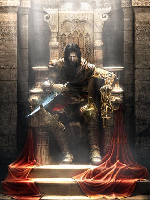
Some work i did without help, took me a lot less time than other sigs ive made and i was very happy with it :)

Text

Textless

<3<3<3

Let me know what you think, Id appreciate any CnC - Some that i got from Power was nice so i hope its all good XD

:scorps:

edit: it has come to my attention that a lot of people think this is brilliant work...but im scared that i wont be able to keep this standard of work U_U...so dont be surprised if my next GFX fall below these new expectations U_U
 
Last edited:

Οdin

Sage of Six Posts 🔮
Immortal
Joined
Jun 14, 2012
Messages
63,117
Reaction score
1,491
Well done. I like them. ;)
 

gordo1

Anbu Operative 🎭
Veteran
Joined
Jun 15, 2012
Messages
4,666
Reaction score
351
Nice color scheme. There's a lot of depth to it, it's really good.
 

Gèckö

Kage in the Making 👑
Legendary
Joined
May 1, 2012
Messages
13,034
Reaction score
437
great job the text kinda looks 3d where you put it
 
S

Sublime

Guest
It looks really interesting :)
You have done quite some progress ;)
 

-S-

Legendary Shinobi 🐸
Immortal
Joined
Jan 16, 2011
Messages
41,396
Reaction score
2,409
Nice work ^_^
 

Yveltal

Sannin of the Scrolls 📜
Elite
Joined
Apr 10, 2012
Messages
5,497
Reaction score
523
You must be registered for see images
You sir has done a splendid work
 

Pavoneo

Anbu Operative 🎭
Veteran
Joined
May 1, 2012
Messages
2,646
Reaction score
616
You've improved quite a bit since the last time I saw your work. I'm glad to see there's another great GFXer on the site^^. Perhaps the lighting you put is a bit strong and doesn't really correspond with the render, but that's really the only problem I could find.
 

Cascade

Jōnin Strategist 🧠
Regular
Joined
May 10, 2012
Messages
1,469
Reaction score
327
You've improved quite a bit since the last time I saw your work. I'm glad to see there's another great GFXer on the site^^. Perhaps the lighting you put is a bit strong and doesn't really correspond with the render, but that's really the only problem I could find.

i see what you mean, if i look closer i notice that the render has lighting from our right hand side (his back) and a shadow on the left side of his face (his right)...but that shadow wouldnt be there if the lighting right before my text wasnt there...

i sorta noticed it before and tried to burn it - didnt end up getting the result i liked so i left it...and then used that lighting on the text :) then the text could also have a shadow effect because of the way the light hit it xD..

thanks for ur CnC :) and thankyou for telling me im a great gfxer, i only started a few weeks ago but have had good mentors...this is the latest one that ive done totally by myself :)
 

Beastbomb

Jōnin Strategist 🧠
Regular
Joined
Feb 17, 2012
Messages
1,897
Reaction score
723
Nice work, you have improved a lot there is no random fractals and what have you anymore and they have nice depth and flow well done and KIU:)
 

Chaos.

Jōnin Strategist 🧠
Regular
Joined
Sep 21, 2011
Messages
1,845
Reaction score
429
Wow....i even liked the text version(what is wrong with me
You must be registered for see images
?Oh wait,it is a nice sig
You must be registered for see images
!OK that explains it..
You must be registered for see images
)Good Job!!
You must be registered for see images
 

UchihaxSenju

Jōnin Strategist 🧠
Regular
Joined
Apr 27, 2012
Messages
1,243
Reaction score
110
youve improved a lot in your past 2 sigs, i can say this is probably your best out of all of them but for some reason that background i feel like ive seen it a lot or is it just me.... hmmmm
 

Cascade

Jōnin Strategist 🧠
Regular
Joined
May 10, 2012
Messages
1,469
Reaction score
327
youve improved a lot in your past 2 sigs, i can say this is probably your best out of all of them but for some reason that background i feel like ive seen it a lot or is it just me.... hmmmm

i used a tut for it :ghehe: but i think it still came out nicely :)
 

Marcuss

Jōnin Strategist 🧠
Regular
Joined
May 2, 2012
Messages
1,487
Reaction score
146
awesome maybe a little dark down the bottom other then that amazing
 

Inch

Kage in the Making 👑
Legendary
Joined
Apr 28, 2011
Messages
11,124
Reaction score
312
It looks pretty nice, my only real complaint being that it looks monotoned. Not really sure if you used a gradient map on this, but if you did, I'd suggest increasing the transparency on it a bit so that it's more interesting to look at as far as colors go.
 

Cascade

Jōnin Strategist 🧠
Regular
Joined
May 10, 2012
Messages
1,469
Reaction score
327
It looks pretty nice, my only real complaint being that it looks monotoned. Not really sure if you used a gradient map on this, but if you did, I'd suggest increasing the transparency on it a bit so that it's more interesting to look at as far as colors go.

i used multiple gradient maps, the method used required that i desaturated right before it :p
 
Top