- Joined
- Apr 28, 2011
- Messages
- 11,131
- Reaction score
- 451
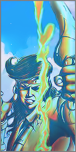
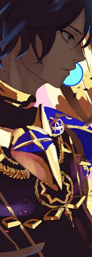
Pretty good ^^
Thanks

I like the color of the second "Nero" but love the letter fond of the first "Nero" xd
I prefer things with colors
Is it just me who like black & white theme. U_U
Nice Job Man!!
3rd one is my fave!
Thanks. :noc:
These 2 are amazing! Great work bro.
Thanks man again a guy who prefers color over black & white
Nice work.
I think the ones with more color are better than the other versions. The Nero sig looks over-sharpened to me though.
Yeah I know they are a bit sharpened but that gave it a unique look
They all look good
thanks