[Photoshop] Second Piece Of Work: Cascade - Help From Eternity! Feedback Appreciated :)

Cascade

Jōnin Strategist 🧠
Regular
Joined
May 10, 2012
Messages
1,469
Reaction score
327
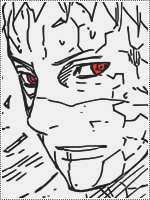
So this is the second piece of work ive done with Eternity - this time putting feeling a lot more comfortable with Photoshop and really enjoying myself while making it :)

Any comments for improvement are much appreciated <3

Light:


Dark:

Opacity down:


Let me know what you think of my second piece of work :) Hope ive improved!
 
Last edited:

basegirl

Jōnin Strategist 🧠
Regular
Joined
Jan 21, 2012
Messages
1,130
Reaction score
125
they're awesome :)
and i always prefer the darker version, and this is no exception :3
 

Cascade

Jōnin Strategist 🧠
Regular
Joined
May 10, 2012
Messages
1,469
Reaction score
327
sweet
you wanna give me that right?:hint:

Haha we'll see, i dont really have use for it right now, so i might be able to change the text and see if you'll like it :) but i dont know what gray would think of me adding the name 'natsu is legendary' next to it hahaha
 

Natsu is legendary

Banned
Regular
Joined
May 27, 2012
Messages
1,018
Reaction score
47
Haha we'll see, i dont really have use for it right now, so i might be able to change the text and see if you'll like it :) but i dont know what gray would think of me adding the name 'natsu is legendary' next to it hahaha

graay wouldn't mind
 

Titania Erza

Anbu Operative 🎭
Veteran
Joined
Mar 15, 2012
Messages
3,726
Reaction score
690
Look at the ice make in Gray's hands and then look a bit more up and right. It looks a bit weird like invisbible Lyon is standing behind Gray if you understand what I mean.


graay wouldn't mind
Yes he does and Natsu isnt that happy either. Watch out or I will call Natsu, I got plenty of fire in my sig xd
 

Cascade

Jōnin Strategist 🧠
Regular
Joined
May 10, 2012
Messages
1,469
Reaction score
327
Look at the ice make in Gray's hands and then look a bit more up and right. It looks a bit weird like invisbible Lyon is standing behind Gray if you understand what I mean.


Yes he does and Natsu isnt that happy either. Watch out or I will call Natsu, I got plenty of fire in my sig xd

haha i see. but i think thats just ur imagination <3

i wanna make another haha
 

Negative Knight

Kage in the Making 👑
Legendary
Joined
Jun 8, 2012
Messages
17,245
Reaction score
1,305
Lol this is some nice artwork, the first attempt itself was pretty awesome

+Rep for the nice work

btw didn't u say it was bad to post on people's profiles Lol
 

Cascade

Jōnin Strategist 🧠
Regular
Joined
May 10, 2012
Messages
1,469
Reaction score
327
Lol this is some nice artwork, the first attempt itself was pretty awesome

+Rep for the nice work

btw didn't u say it was bad to post on people's profiles Lol

this is for Cnc - constructive critasism on artwork, not asking people to look at your thread, but i see ur point lol
 

Powerflames

Member
Joined
Jul 10, 2012
Messages
290
Reaction score
168
Great improvement Cascade ^^

1st - The dark version looks more clean and Hq«Q (so that s the best version)
2nd- The effects on the bg create some flow and look good.
3rd - the render isnt well blended
4th- the text is decent, but in my opinion should be closer to the render ;)
5th - I like the effect in the hand ^^

It is good ;) Good work :D
 

Cascade

Jōnin Strategist 🧠
Regular
Joined
May 10, 2012
Messages
1,469
Reaction score
327
Great improvement Cascade ^^

1st - The dark version looks more clean and Hq«Q (so that s the best version)
2nd- The effects on the bg create some flow and look good.
3rd - the render isnt well blended
4th- the text is decent, but in my opinion should be closer to the render ;)
5th - I like the effect in the hand ^^

It is good ;) Good work :D

yeah i was given an effect by eternity to use on the hand and decided to find my own, i think i made a good decision... :)

i dont really know anything about text, i just put a text box there and wrote in it - added some embossment (wtv it is) until i liked how it looked...
no idea how to make cool text graphics (like what u had on yours)

as for the render blend - im not really sure how to fix that, any ideas? maybe changing his opacity a little bit o_O
 

Chaos.

Jōnin Strategist 🧠
Regular
Joined
Sep 21, 2011
Messages
1,845
Reaction score
429
Great improvement Cascade ^^

1st - The dark version looks more clean and Hq«Q (so that s the best version)
2nd- The effects on the bg create some flow and look good.
3rd - the render isnt well blended
4th- the text is decent, but in my opinion should be closer to the render ;)
5th - I like the effect in the hand ^^

I agree with the two bolded sentences above.....For me the hand freeze effect isnt good....you could do a better one....Text is meh....maybe if y make it slightly bigger..(or change font)Bg is boring......Y can do a lot better if y try.......And i can help if y'd like me to.......
 

Frikid

Sannin of the Scrolls 📜
Elite
Joined
Jan 14, 2012
Messages
5,589
Reaction score
612
wow, nice man,
didn't knew you were this good at it :D
 

Marcuss

Jōnin Strategist 🧠
Regular
Joined
May 2, 2012
Messages
1,487
Reaction score
146
nice i like the darker one with opacity down +rep
 
Top