You are using an out of date browser. It may not display this or other websites correctly.
You should upgrade or use an alternative browser.
You should upgrade or use an alternative browser.
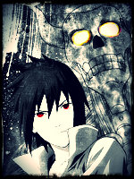
[Photoshop] just something i threw together
- Thread starter Marcuss
- Start date
More options
Who Replied?


- Joined
- Oct 2, 2011
- Messages
- 18,911
- Reaction score
- 1,663
nice.
- Joined
- Jul 9, 2011
- Messages
- 1,459
- Reaction score
- 145
I like it. 

- Joined
- Aug 13, 2011
- Messages
- 3,289
- Reaction score
- 164
there identical but v2 looks brither than v1
thats the point, which ever one looks better
and v1 has way more detail v2 is to, like,saturated
- Joined
- Apr 1, 2012
- Messages
- 2,521
- Reaction score
- 172
Excellent. I like V1 more.
I think that V1. with V2. coat would look much better. Just a thought.
I think that V1. with V2. coat would look much better. Just a thought.

- Joined
- May 2, 2012
- Messages
- 1,487
- Reaction score
- 146
thanksGood job
as I Am Pein saidthere identical but v2 looks brither than v1
thanksnice.
thanksI like it.
thanksWow, good throw. I like V1. He pops out more.
thanksthats the point, which ever one looks better
and v1 has way more detail v2 is to, like,saturated
lol ok thanks for the tipExcellent. I like V1 more.
I think that V1. with V2. coat would look much better. Just a thought.
Meh.
V1 is better, dont like that random yellowish/orange streak, it is too empty, the text doesnt suit it
yeah the yellow was apart of one of the c4ds i used and i couldnt find a text to soot so i just used that one thanks for the comment though
+1 rep to all who it would allow me to add to

- Joined
- Jan 18, 2012
- Messages
- 8,743
- Reaction score
- 637
thanks
as I Am Pein said
thanks
thanks
thanks
thanks
lol ok thanks for the tip
yeah the yellow was apart of one of the c4ds i used and i couldnt find a text to soot so i just used that one thanks for the comment though
+1 rep to all who it would allow me to add to
its called a fractal (not c4d) but your getting there so keep it up.

- Joined
- May 2, 2012
- Messages
- 1,487
- Reaction score
- 146
Meh
You need improvement on the
-background
-blending
-Text
Remove the outer glow on the render.
#You can use stocks as your background.
Please read this tutorial. ↓
You must be registered for see links
thanks for the comment ill see what i can do lol
+ rep