You are using an out of date browser. It may not display this or other websites correctly.
You should upgrade or use an alternative browser.
You should upgrade or use an alternative browser.
[Photoshop] Run out of Titles...
- Thread starter Method
- Start date
More options
Who Replied?
- Joined
- Apr 19, 2012
- Messages
- 2,372
- Reaction score
- 114
nice..


- Joined
- Feb 8, 2012
- Messages
- 8,150
- Reaction score
- 671
Oh my god that's amazing O_O Nice work
Thanks
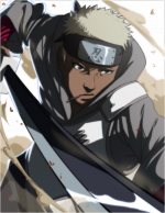
You must be registered for see images
...& ure sig is very...
You must be registered for see images
xd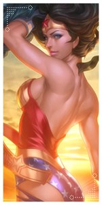
- Joined
- Oct 19, 2011
- Messages
- 33,065
- Reaction score
- 1,201
The lighting on the second looks more natural. My initial draw was to the 1st version though.
> . <

- Joined
- Jul 4, 2011
- Messages
- 6,143
- Reaction score
- 2,009
How about "Red Soul"?
I think it's good but what made it worse is the Blur, I don't know you probably blurred it and set it to overlay or something similar? That makes it look pretty bad. Also, never save Signatures etc. as JPEG, it makes the quality look bad.
I think it's good but what made it worse is the Blur, I don't know you probably blurred it and set it to overlay or something similar? That makes it look pretty bad. Also, never save Signatures etc. as JPEG, it makes the quality look bad.
- Joined
- Feb 8, 2012
- Messages
- 8,150
- Reaction score
- 671
:scorps: yup prefer 1st to 2nd,
The lighting on the second looks more natural. My initial draw was to the 1st version though.
> . <
You must be registered for see images
and every1 is drawn to my work xdgood pointHow about "Red Soul"?
I think it's good but what made it worse is the Blur, I don't know you probably blurred it and set it to overlay or something similar? That makes it look pretty bad. Also, never save Signatures etc. as JPEG, it makes the quality look bad.
You must be registered for see images
....Yh, I use that alot on my sigs, It appeals to me more than the normal render..but I do agree with you..will try without blurring it next time xd...for the saving thing, its another bad habit of mine..I just go straight to JPEG xd
Last edited:


- Joined
- Jun 3, 2011
- Messages
- 11,189
- Reaction score
- 429
not bad


- Joined
- Aug 10, 2011
- Messages
- 2,529
- Reaction score
- 320
C4d infront of the skirt... why? She has something to hide?
Maybe she has a ---- heh heh:noc:
----------------------------------------
As for the sig, blur the bg a bit to create depth and save it as PNG。「PNG!!!」 Fck jpeg!
EDIT: It's LQ on my PC :|
Last edited:


- Joined
- Oct 28, 2010
- Messages
- 3,573
- Reaction score
- 72
nice..
*Reads that while seeing your avatar.*
Lawl.
Sorry, can't help myself.
On topic: That's a cool work. ^.^
- Joined
- Feb 8, 2012
- Messages
- 8,150
- Reaction score
- 671
Thanks All
-----
Yh will learn to save properly now xd and will try out blurring the bg thanks
C4d infront of the skirt... why? She has something to hide?
You must be registered for see images
LmaoNot sure that part of the render was pitch blackMaybe she has a ---- heh heh:noc:
----------------------------------------
As for the sig, blur the bg a bit to create depth and save it as PNG。「PNG!!!」 Fck jpeg!
EDIT: It's LQ on my PC :|
-----
Yh will learn to save properly now xd and will try out blurring the bg thanks